How to create animated text GIFs
Twelve working examples, from a quiet email headline to a typing introduction. Choose the right mode, make the lettering readable, and give each message time to land.
Animated text works best when the movement has a job. A quiet highlight can draw attention to a new collection. A sequence can explain three steps without shrinking them onto one crowded card. A typing effect can introduce a person in a way that feels conversational.
This guide uses twelve GIFs made with the Animated Text Generator. Each example starts with a real placement, then explains the mode, lettering, and timing behind it. Treat the settings as starting points: the same movement can feel very different on a two-word headline and a long sentence.
Choose the right way to animate your message
The editor offers three approaches. In Single, keep one message on screen and give it a repeating movement. In Slides, put each phrase on a separate line to show the phrases in sequence. In Typing, reveal and erase the phrases character by character.
| What you need | Start with | Why it fits |
|---|---|---|
| A short headline that stays readable | Single with Shine or Pulse | The complete message remains available while the emphasis moves |
| An announcement with several points | Slides with Fade or Slide in | Each phrase gets its own space and reading pause |
| A personal introduction | Typing | The words arrive like a short conversation |
| A playful greeting or sticker | Single with Wave or Jump | Individual letters provide the personality |
| A technical or music-related title | Single with Glitch | Brief disruption supports an intentionally electronic style |
| A restrained event invitation | Slides with Fade | The information stays more prominent than the effect |
There is another useful choice inside an effect: what moves together. Text treats the message as one object. Words preserves word shapes while changing their timing. Chars makes individual letters move, and Lines can organize a multiline block. Available choices depend on the effect. Start with whole text or words for information, and individual characters when the motion itself is part of the design.
1. A new-arrivals headline for an email
An email hero has very little time to establish its message. “NEW ARRIVALS” already says what matters; it does not need a long entrance or a second line of moving copy. Here, a restrained Shine passes across dark lettering on a warm background. The headline stays in place, so a reader who looks away can return without waiting for the words to rebuild.

Use Single, Anton, and Shine. This example uses a 640 × 280 canvas, 52 px text, dark brown ink, and a cream fill. Leave padding around the lettering rather than stretching the headline to every edge. If the movement feels busy, slow its cycle before reducing the type size.
Place the GIF above the product photography and keep the actual offer, deadline, and button as ordinary email content. An image is not a substitute for selectable information or a working link. Email playback varies; Microsoft documents that Outlook animation can be disabled in settings. Test a real message in the clients your audience uses. Our email GIF guide covers insertion and display sizing.
2. A product launch told in three short slides
“Meet the new collection” creates the introduction. “Made for everyday” adds a reason to care. “Explore the range” supplies the next step. Putting all three on one small banner would make the message compete with itself. A sequence gives each phrase room.

Choose Slides and enter the three phrases on separate lines. Use Inter at 42 px, a muted green canvas, and a darker green text color. Select Slide in for the entrance and animate by words; use a simple Fade exit so the outgoing message does not fight the next arrival.
Increase Delay until the longest phrase is comfortable to read once, without anticipating it. The example holds completed slides for about 1.6 seconds. More words need more time. Do not make the shortest phrase dictate the pace of the whole sequence. If this is an email, repeat the call to action below the image; a viewer might only see the opening slide.
3. A typing introduction for a portfolio
A portfolio introduction can show two complementary roles without turning the heading into a paragraph. “I design identities.” followed by “I build digital experiences.” is specific enough to tell a visitor something, and short enough to type naturally.

Use Typing, Inter at 38 px, and one sentence per line in the editor. Choose a bar cursor for a familiar writing rhythm. Set the typing speed so the longer sentence does not become an endurance test, then adjust erasing separately: deletion can be quicker than the introduction without making the reading phase hurried.
The important setting is the pause after completion. A beautifully paced reveal still fails if the sentence vanishes as soon as its final character appears. Leave time to read the whole thought. If your website already has a moving hero image, a static introduction may be a better choice. Use this GIF as supporting artwork, with the same role or service written in accessible page text.
4. A welcoming message for a community
A welcome post should feel friendly without requiring a complicated illustration. A small wave across “HELLO, EVERYONE” gives the letters a shared rhythm. The muted pink and dark plum palette keeps it warmer than a high-contrast alarm-style announcement.
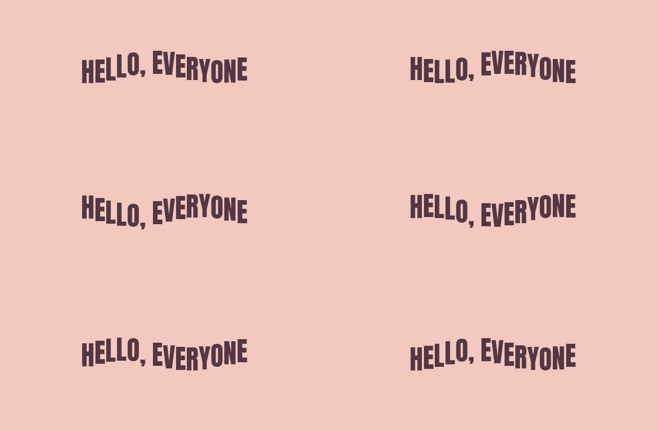
Start with Single, Anton at 52 px, and Wave applied to characters. Keep the vertical movement modest. There should be enough space above and below the text for its highest and lowest positions; the resting frame alone does not tell you whether it fits.
This works for a group-chat greeting, a membership welcome, or the first slide in an informal presentation. It is less suitable for a tiny custom emoji: the phrase will become too small. For that destination, shorten it to “HI” and make a dedicated square version. The Discord GIF guide explains why messages, emoji, and profile assets need different exports.
5. An outlined sale headline with a small wiggle
A sale graphic does not need rapid flashing to be noticeable. In this example a small wiggle gives outlined letters a little movement while the words remain readable. Cream text and a pale pink outline stand out against navy without making the entire background pulse.
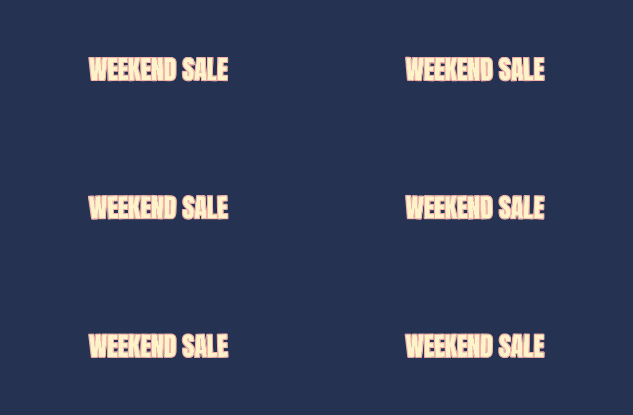
Use Anton at 52 px with Wiggle and character-level animation. Keep its angle low; this example uses one degree. Add a thin contrasting outline before experimenting with a second one. Judge the result at the actual banner width: a stroke that looks elegant in a large preview can close the spaces in an E or A when reduced.
Keep prices, discount conditions, and end dates outside this decorative loop. A short headline can carry the energy while nearby text carries the details. If the outline starts to look noisy, simplify its color or thickness before making the whole headline smaller. The goal is a clear sale message, not a demonstration of every available text effect.
6. An invitation for an open studio or workshop
An invitation has a different voice from a promotion. A serif face, warm paper color, and gentle transitions can make a digital announcement feel considered. The three slides here introduce the event, provide the date and time, and close with an invitation.

Choose Slides, Baskerville at 42 px, and Fade for both entrance and exit. Animate the whole text so the date stays together. Breaking a date into independently moving letters adds activity without improving comprehension.
This approach also works for a book launch, a small exhibition, or a workshop reminder. Enter the venue and booking link in the accompanying message rather than squeezing them into another tiny line. If the event has many details, the GIF can simply say “You’re invited” and direct attention to the full invitation below. Preview every slide: the date line is often wider than the event name.
7. A three-step instruction card
A sequence can explain a small workflow when a screen recording would contain more interface than instruction. “Choose a photo,” “Add your message,” and “Export and share” give someone a quick overview before they start.

Use Slides, Inter at 44 px, and a line-level Wipe. The blue palette gives the card a calm instructional tone. Keep the same alignment and type size across all three steps so the animation changes the instruction, not its visual hierarchy.
This is an overview, not a replacement for a tutorial. If a reader needs to find a particular button or see a gesture, use an actual screen recording alongside the text. Our screen-recording GIF guide covers that approach. Also keep the steps in ordinary text near the animation, so a reader can consult one without waiting for the loop to return.
8. A benefit sequence for a product page
Feature lists often describe the product from its maker’s point of view. A short benefit sequence can translate them into the visitor’s experience: “Less setup,” “More creating,” and “Your next idea starts here.” The first two phrases establish a contrast; the last connects it to an action.

Choose Slides with Pop applied to words, Inter at 42 px, and a restrained purple palette. Word-level motion lets a phrase arrive in a recognizable order. Character-level bouncing would make the longer final line much harder to follow.
Use this as a small campaign asset, an onboarding announcement, or part of a presentation. Keep a normal headline and explanation beside it on a product page. If you need product photography in the same story, use a product carousel GIF rather than trying to turn a text-only composition into a full product demonstration.
9. A title for a music release or late-night event
“AFTER HOURS” uses a short glitch to suggest an electronic mood. The effect belongs to the subject: it would be a poor default for a wedding invitation or a long safety instruction. A dark background and mint lettering do most of the work before anything moves.
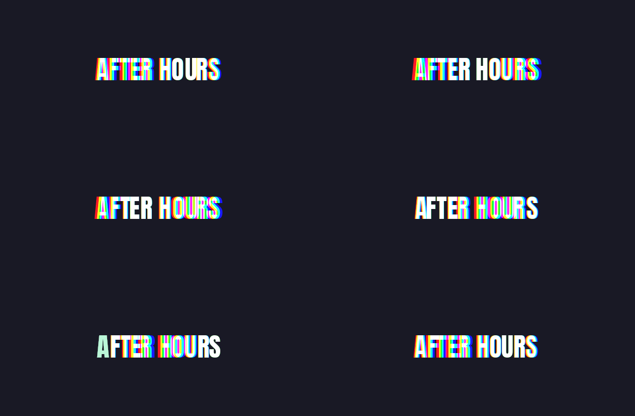
Use Single, Anton at 52 px, and Glitch. Keep the phrase short and leave generous horizontal space for displacement. Increase the effect cautiously; when you can no longer recognize the words during a normal glance, it has stopped helping the announcement.
For a social platform that expects video, export MP4 instead of assuming it accepts a GIF as a native animated post. Add audio elsewhere if needed; a GIF itself has no soundtrack. Keep performer names, venue, and ticket information as stable text in the surrounding post. The animated title can set the mood without carrying the entire poster.
10. A thank-you card after a purchase or event
A thank-you message benefits from restraint. The small whole-text pulse here gives the card a little life while the serif lettering and warm palette keep it personal. It could close a customer update, a presentation, or a message to workshop attendees.
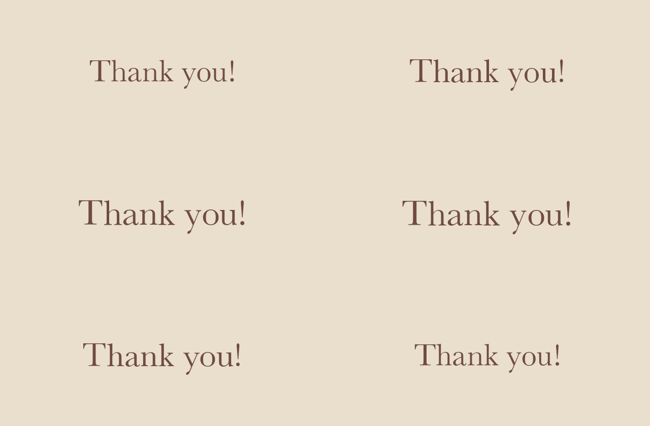
Choose Single, Baskerville at 62 px, and Pulse applied to the whole text. Keep the amount low so the words feel like they breathe rather than jump toward the viewer. Make sure the largest point in the cycle still fits comfortably within the canvas.
Write the personal message outside the GIF: what you are thanking someone for matters more than the animation. For a more intimate sign-off, a static handwritten name can be a better companion than another moving element. Avoid surrounding this card with several unrelated loops in the same email or slide.
11. A playful text sticker for a creative team
“GOOD IDEAS” becomes a small celebratory asset through bold lettering, yellow fill, and jumping characters. It could accompany a brainstorm result, a team update, or a short encouragement in chat. The words are deliberately simple because the movement is more expressive.

Choose Anton, Jump, and character-level animation in Single. Leave extra space above the text. Increasing the jump height without increasing padding can clip the highest letters even when the first frame looks fine.
For a much smaller placement, simplify the phrase before adding outlines or shadows. Bold letter shapes survive reduction better than decorative details. The downloaded file remains an image: calling it a sticker does not make it compatible with every platform’s dedicated sticker uploader. Check the format accepted by the destination, or send it as an ordinary GIF attachment.
12. A branded closing card with subtle depth
A brand sign-off should still look like the same identity when paused. Here the lettering, palette, and shallow extrusion establish the design; Shine adds a finishing movement. The card could end a short demonstration or accompany a creative newsletter.
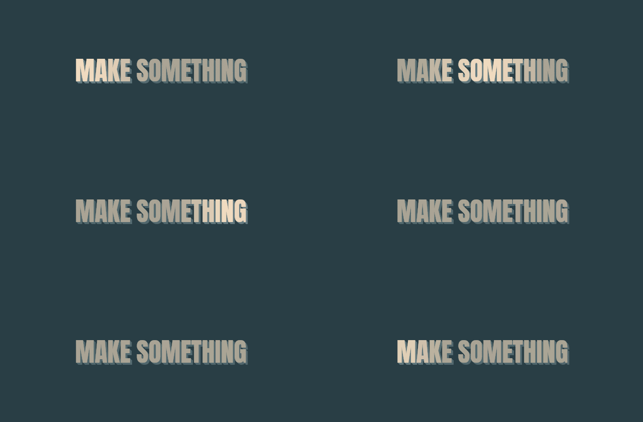
Use Anton at 52 px, Single, and Shine. Add 3D with a small depth; this example uses 5 px at 45 degrees. Choose a muted extrusion color that separates from the fill without becoming a second headline.
Inspect both the edges and the spaces inside letters at the intended display width. A deeper cast is not automatically more polished. If the result looks crowded, reduce the depth or increase spacing slightly. For a footer or small signature area, a static brand mark may remain clearer; reserve the moving card for a placement with enough room.
Make the type fit before tuning the motion
Set the canvas shape for the destination first. Then choose the font and adjust size, padding, and spacing together. Reducing the font is only one solution to a crowded composition: shortening the sentence or giving it another slide often produces a stronger result.
Use the canvas position controls to anchor text where the layout needs it. Centering suits a self-contained card; left alignment can work better when the GIF sits above left-aligned copy. With multiline text, inspect line height as well as letter spacing. Ascenders, descenders, outlines, and shadows all need room.
A curved baseline can suit a short badge-like phrase, but it makes longer information harder to scan. Likewise, two outlines or a strong glow may suit a decorative word and overwhelm an instruction. Add one layer of styling at a time and compare the result at the width people will actually see.
Tune the loop around reading time
A movement can be smooth and still be badly timed. Read the message aloud once without trying to keep up. If the next slide arrives before you finish, increase the hold. In Typing mode, assess writing, completed text, and erasing as three separate phases.
Watch the boundary between the last and first frames. A loop that repeatedly cuts off a final word feels unfinished. For a repeating Single effect, compare at least two complete cycles; one pass can hide an awkward restart. Prefer a short message over a long animation when the destination is a small banner or chat preview.
Export a clear file without making it unnecessarily large
All twelve examples were rendered at 640 × 280 and 20 frames per second. That is a useful size for the illustrations in this guide, not a universal banner specification. Start with the dimensions of your actual placement. Exporting a large image that will be displayed as a tiny thumbnail wastes bytes and can make thin text look worse after reduction.
Use GIF where animated images are accepted. Choose MP4 where a platform expects video, or WebP where the destination supports animated WebP. Do not assume an email client, website builder, or social uploader handles all three formats identically.
First simplify the message and shorten unnecessary pauses. Then reduce pixel dimensions if the asset will be displayed smaller. Only then compare lower quality or frame-rate settings. A soft fade may tolerate fewer frames differently from fast moving letters; our GIF frame-rate guide explains the trade-off. If you have a strict upload budget, use the GIF Compressor and compare the result with the original.
A final check before publishing
View the GIF at its final size on a phone as well as a desktop. Check every phrase for clipping, read the smallest text, and inspect the first frame. Send yourself an actual email or upload a draft to the intended platform instead of judging only the editor preview.
Keep the editable wording and chosen settings somewhere you can reuse them; the exported GIF is a finished image, not a text project. When the campaign changes, regenerate from the original message rather than adding another compressed layer over an old GIF. Start your own version in the Animated Text Generator, and choose the simplest movement that makes the message more useful.
Animated text GIF questions
Which mode should I use for animated text?
Use Single for one repeating headline, Slides for separate phrases shown in sequence, and Typing for a message that types and erases character by character.
Can I make a typing GIF with more than one sentence?
Yes. Enter each phrase on a separate line in Typing mode. Adjust typing, erasing, and the delay after the completed phrase so viewers can read it before it disappears.
What size should an animated text GIF be?
Match the intended placement. The examples here use a 640 × 280 canvas, but a chat sticker, email banner, and website header may need different proportions. Check the animation at its actual display size.
Can I put an animated text GIF in an email?
Yes, where your email editor supports image insertion. Test the delivered message, keep important details and links as ordinary text, and ensure the message still works if animation or image loading is disabled.
How do I animate text over an existing GIF?
Use Add Text to GIF for captions over an existing animation. Animated Text Generator creates a separate text composition with its own canvas, typography, and animation.