Countdown timer GIF durations: what to use and when
A practical guide to choosing seconds, minutes, hours, or days for emails, launches, sales, events, and messaging campaigns.
A countdown works when its duration matches the reader's real decision window. Seconds create immediacy. Minutes support a task already in progress. Hours make a same-day deadline tangible. Days build anticipation and give people time to compare, plan, or return. A longer timer is not automatically better: if the deadline feels remote, the clock becomes decoration; if it feels unrealistically short, it can damage trust.
Use the Free Countdown Timer GIF Generator to set a fixed duration or deadline, choose the units, add a title or captions, and export an animated clock for your campaign. Starting with a purpose-built generator also makes it easier to test several durations before choosing the version that best matches the audience's decision window.
At-a-glance duration guide
| Duration | Best fit | Example title |
|---|---|---|
| 10–30 seconds | Micro-actions, reveal moments, live-session starts | "Starting now" |
| 1–3 minutes | Quick challenges, chat offers, imminent events | "Only 2 minutes left" |
| 5–10 minutes | Checkout or reservation windows | "Reserved for you" |
| 15–30 minutes | Flash access, short live drops | "Final half hour" |
| 1–6 hours | Last-call reminders, same-day cutoffs | "Ends in a few hours" |
| 12–24 hours | Daily deals, cart recovery, "ends tonight" | "Today only" |
| 48–72 hours | Weekend promotions, short registration windows | "3 days to save" |
| 3–7 days | Launches, preorders, major sale warm-ups | "One week to go" |
| 10–14 days | Webinars, conferences, early-bird deadlines | "Save your seat" |
| 30 days | Large launches, seasonal events, renewals | "The countdown begins" |
How long should a countdown timer GIF run?
Each range below suits a different kind of decision. Match the one that reflects how much time your audience genuinely needs.
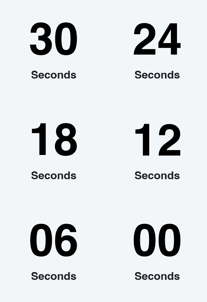
10–30 seconds: reserve them for immediate moments
A 10-, 20-, or 30-second animation is best when the reader is already poised to act: a live broadcast is opening, a reveal is about to happen, or a brief interaction needs a visible beat. It is usually too short for a purchase decision inside a normal marketing email, because many recipients will not see the message immediately after delivery. Use it for synchronized or playful experiences, not as a false deadline.
This duration is especially useful for live-stream or webinar holding screens, product reveal animations, and gamified email moments and quick giveaways. Clear timer titles can reinforce the purpose without adding much visual noise; suitable options include "Starting now", "Reveal in 10 seconds", or "Last seconds". Choose the wording that most accurately describes whether the timer marks a start, an ending, or a limited access window.
1–3 minutes: drive a quick action already within reach
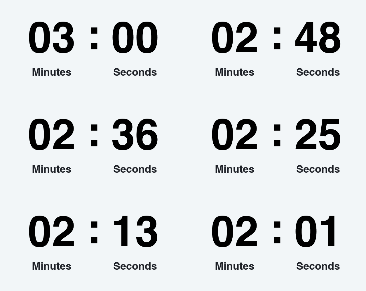
People searching for a 1 minute countdown timer, 2 minute timer, or 3 minute countdown usually need an immediate, low-friction action: claim a code, join a session that is starting, complete a quiz, or respond in chat. A WhatsApp countdown timer GIF can work especially well here because the message is immediate. In email, use these durations for scheduled reminders or demonstrations rather than assuming every subscriber opens at send time.
This duration is especially useful for last-minute event reminders, short coupon unlocks or chat promotions, and tutorials that demonstrate a timed task. Suitable titles include "Only 1 minute left", "Starting in 3 minutes", or "Claim it now".
5–10 minutes: support checkout and reservation urgency
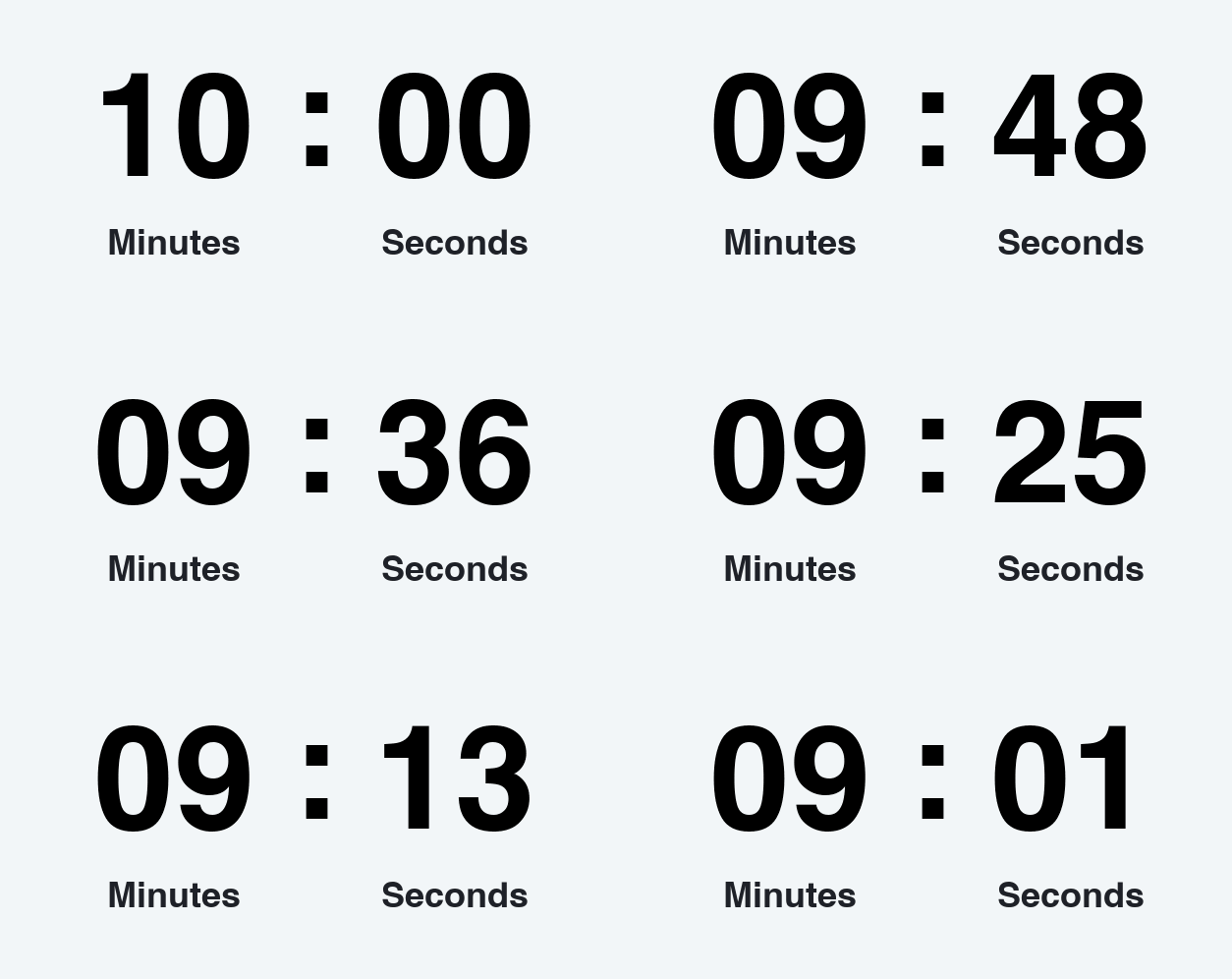
A 5 minute countdown suits a very short reservation, while a 10 minute countdown gives a motivated customer more time to finish checkout, confirm a booking, or use a reserved discount. This range works best when the time limit is genuine and the customer has already entered the conversion flow. In a broadcast email, present it as the length of the offer after activation — not as a deadline that began long before the email was opened.
If the checkout timer needs a tighter crop, shorter loop, or more informative opening frame, refine it in the Free GIF Editor before placing it beside the checkout button. A focused frame keeps the numbers readable on mobile and prevents secondary details from competing with the purchase action.
This duration is especially useful for cart or ticket reservation windows, limited appointment slots, and post-click bonus offers. Suitable titles include "Reserved for you", "Complete your order", or "Your bonus expires".
15–30 minutes: create a compact flash window
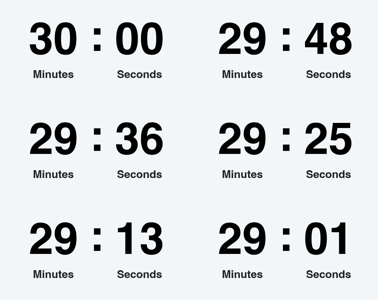
A 15 minute countdown is useful for a rapid live-shopping offer, while a 30 minute timer gives customers more room during members-only access, limited inventory drops, or short promotional windows. Both create stronger urgency than an hourly timer while leaving enough time to evaluate a familiar product. Pair the animated clock with clear eligibility, stock, or deadline details so it feels informative rather than pressuring.
For a product drop, introduce the item with motion made in the Free Image to GIF Maker, then place the countdown in the next content block so the two animations do not compete. This creates a clear sequence in which the product attracts attention first and the timer explains why the customer should act now.
This duration is especially useful for VIP early access, live-shopping specials, and limited inventory releases. Suitable titles include "Final half hour", "VIP access ends soon", or "Drop closes in".
1–6 hours: make same-day deadlines visible
A 1 hour countdown fits a final reminder sent on the day of an event or promotion. This short countdown clock is appropriate for "last chance" messaging; three to six hours works for delivery cutoffs, same-day sales, and registration closing later that day. Display Hours : Minutes : Seconds to keep the deadline concrete without adding an unnecessary days field.
This duration is especially useful for final-call sale emails, same-day delivery cutoffs, and webinar and event start reminders. Suitable titles include "One hour left", "Order by 4 PM", or "Doors open soon".
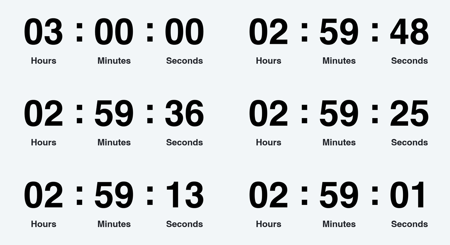
12–24 hours: the versatile promotional standard
A 24 hour countdown timer is a strong default for daily deals, abandoned-cart incentives, and full-day promotions. A 12-hour countdown clock works better when the message arrives in the morning and the offer ends that night. Both give readers a realistic chance to act while keeping the deadline close and visible.
Because daily-deal emails are often image-heavy, check the final asset size and use the Free GIF Compressor when the timer exceeds an email editor's limit or loads too slowly on mobile. Reducing unnecessary dimensions, colors, or frames can improve loading speed while keeping the deadline clear.
This duration is especially useful for deal of the day, abandoned-cart discounts, and the final day of registration. Suitable titles include "Today only", "Ends at midnight", or "24 hours to save".
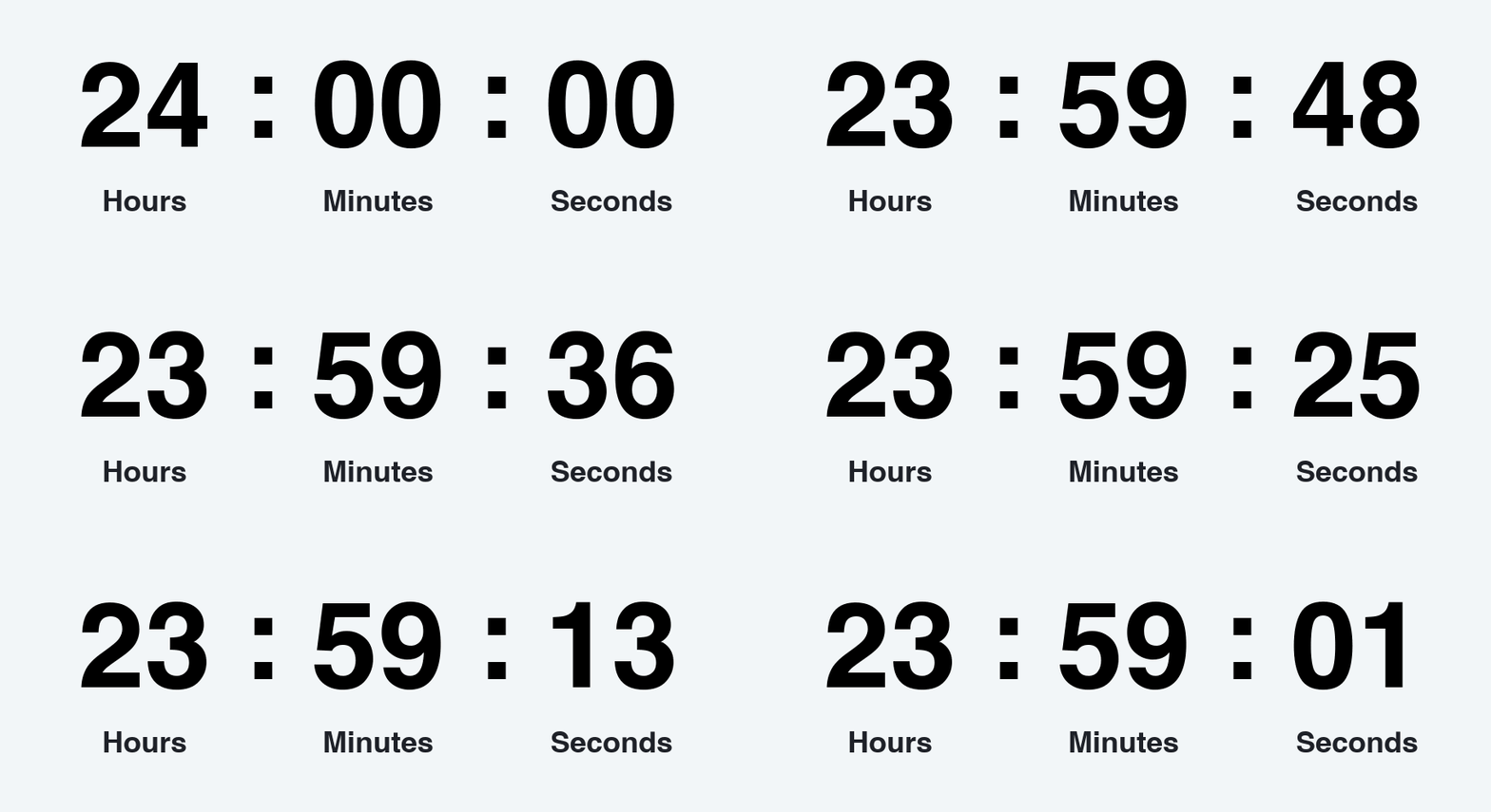
48–72 hours: balance urgency with consideration
A 48 hour countdown gives customers time to compare products, coordinate schedules, or wait for payday without losing urgency. Extend the timer to 72 hours for a full three-day or weekend campaign. Show Days : Hours : Minutes : Seconds; the decreasing day count keeps the visual meaningful across multiple sends without making the deadline feel distant.
A weekend campaign can reinforce the numeric clock with a simple "Ends Sunday" message made in the Free Scrolling Text GIF Generator. Use the two animations in separate messages or sections to keep the design focused, and repeat the same deadline wording so readers immediately connect the moving text with the offer.
This duration is especially useful for weekend promotions, three-day booking windows, and short course enrollment periods. Suitable titles include "Weekend sale", "3 days only", or "Booking closes Monday".
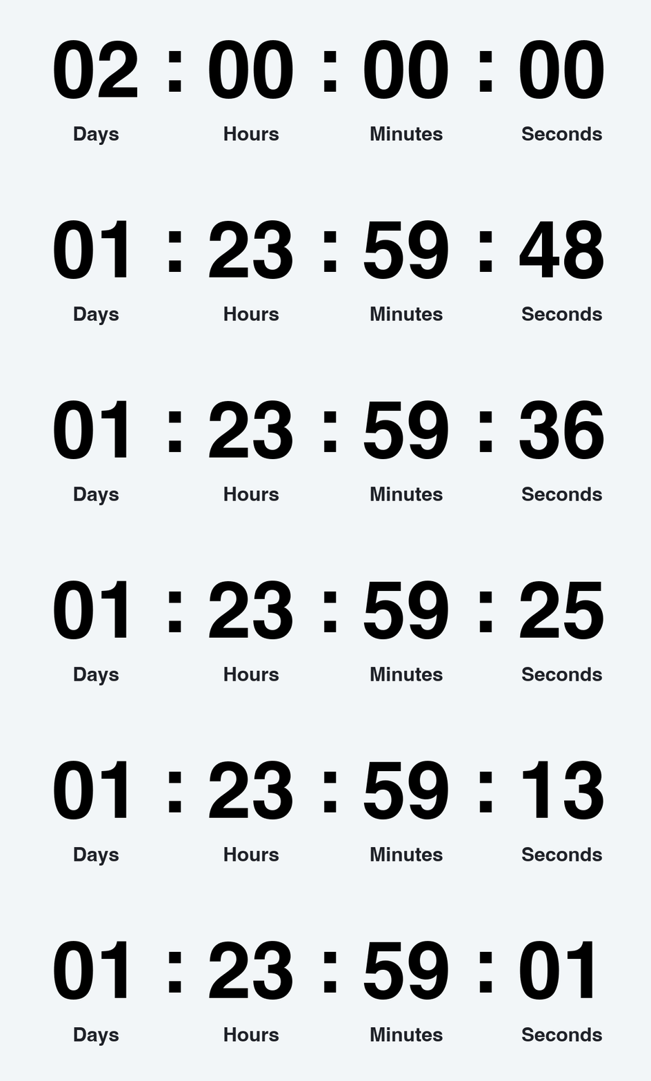
3–7 days: build anticipation before a major moment
A 7 day countdown timer works when awareness matters as much as urgency. Shorten it to three or five days for a later reminder in product launches, preorders, Black Friday or Cyber Monday warm-ups, collection drops, and early-access openings. Plan a sequence: announce the date, remind readers midway, then switch to hours on the final day. This changing granularity makes every message feel newly relevant.
If the launch needs to preview several products or angles, build the visual sequence with the Free GIF Slideshow Maker and reserve the countdown for the CTA block where the deadline matters most. This structure gives the products enough room to be understood before the campaign introduces urgency.
This duration is especially useful for product and collection launches, preorder closing dates, Black Friday and seasonal campaigns, and one-week challenges. Suitable titles include "One week to go", "Launching Friday", or "Big sale coming".
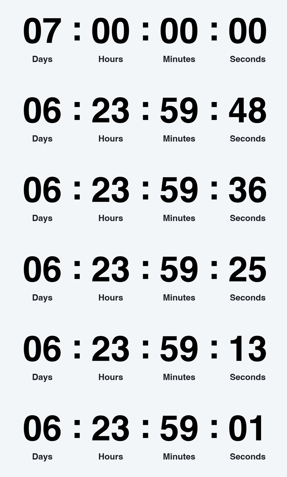
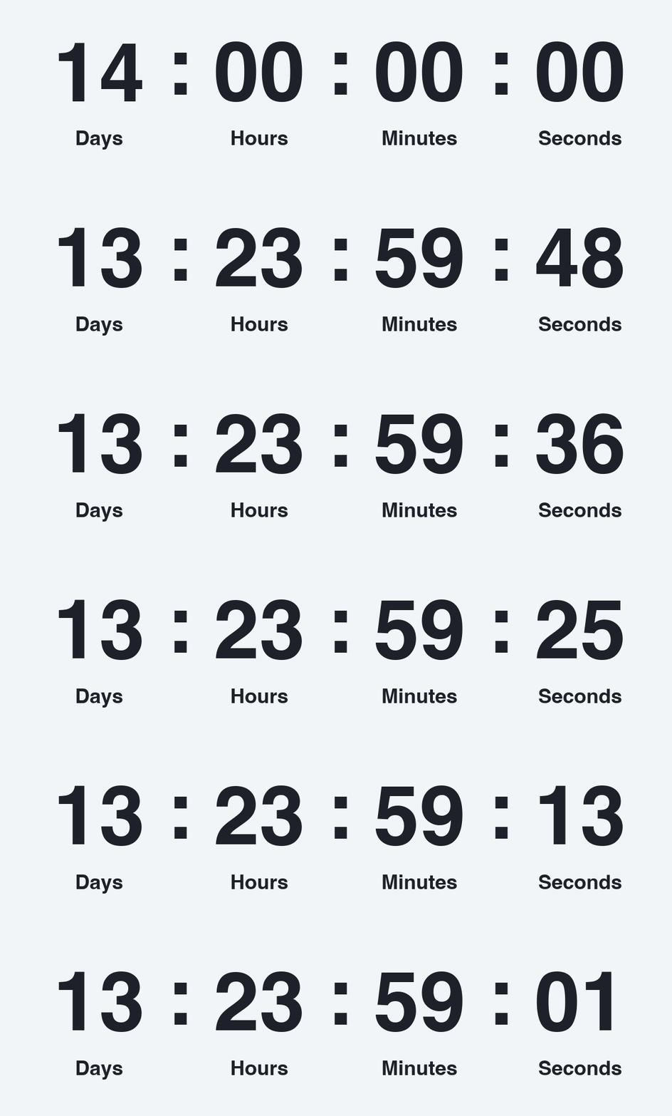
10–14 days: support planning and registration
Ten- to fourteen-day timers suit events that require calendar planning, travel, approval, or preparation. They work for webinars, conferences, workshops, applications, and early-bird pricing. Lead with the date and benefit, not only the moving clock. As the deadline approaches, shorten the displayed units and increase reminder frequency based on engagement.
This duration is especially useful for conference registration, webinar promotion, early-bird pricing, and application deadlines. Suitable titles include "Save your seat", "Early bird ends in", or "Two weeks to go".
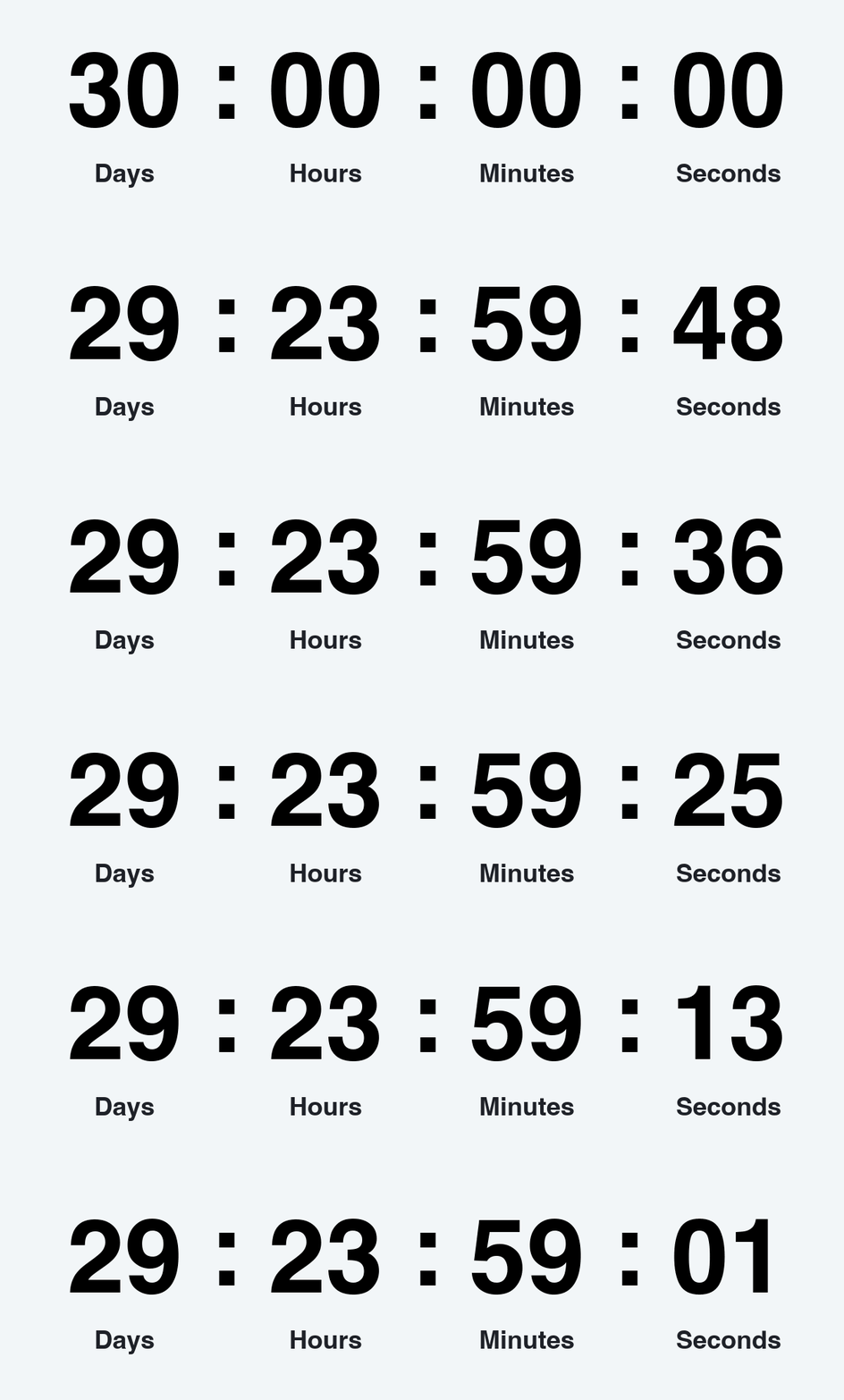
30 days: create a campaign runway
A 30 day countdown is best for a meaningful future milestone: a major product release, seasonal event, subscription renewal, or public launch. This long countdown clock should anchor a broader content plan rather than appear in every message. Use Days : Hours early in the campaign, then introduce minutes and seconds only when the deadline becomes close enough to feel actionable.
This duration is especially useful for major launches, seasonal events, renewal or fundraising deadlines, and long registration campaigns. Suitable titles include "The countdown begins", "30 days until launch", or "Coming next month".
Fixed-duration GIF or date-based countdown?
The best timer type depends on whether the animation needs to show a reusable length of time or the actual time remaining until a shared deadline. Both formats can look similar inside an email, website, or message, but they behave differently after delivery. Understanding that difference helps prevent inaccurate timers and makes it easier to choose the right format for each campaign.
Fixed-duration
A fixed-duration countdown GIF is a pre-rendered animation that runs through a set period, such as 30 seconds, 5 minutes, or 24 hours. The file does not know the current date, the recipient's location, or the campaign deadline. It simply plays its frames when the viewer's app or email client loads the image, and it may restart from the beginning when the animation loops or the message is reopened.
This format works well when the duration itself is the content. Common use cases include timed exercises, product demonstrations, quiz challenges, presentation breaks, event holding screens, social posts, WhatsApp messages, and examples that show how a timer will look. It is also useful when the countdown begins after a known user action, such as opening a training step or starting a short task. Because recipients may open an email at different times, a fixed-duration GIF is usually not the best choice for a sale or registration that ends at one exact moment.
Choose a fixed-duration timer when portability and simplicity matter more than synchronization. The GIF can be downloaded, uploaded like a normal image, and reused across channels without relying on a hosted timer service. Before publishing it, make sure the opening frame communicates the purpose clearly and that looping the animation will not create a misleading impression that an expired offer is still available.
Date-based
A date-based countdown is connected to a specific deadline, such as Friday at midnight, the beginning of a webinar, or the end of an early-bird registration period. A hosted image or server-generated timer calculates the remaining time when the image is requested, so people who open the same campaign at different moments can see a countdown that reflects the approaching event rather than a fixed animation that always starts from the same number.
This format is better suited to flash sales, Black Friday campaigns, product launches, ticket releases, webinar reminders, delivery cutoffs, booking windows, subscription renewals, fundraising deadlines, and seasonal promotions. It is especially useful when several emails are sent during one campaign because the same deadline can remain consistent across the announcement, reminder, and last-chance messages. The timer should use the correct time zone and include the deadline in words so readers can still understand the offer if the animation is cached, delayed, or displayed as a static frame.
Choose a date-based timer whenever accuracy at the moment of opening is central to the message. Confirm what the timer displays after the deadline, test it in the email clients used by your audience, and avoid resetting the end date unless the campaign genuinely changes. If exact synchronization is not essential and the animation is mainly illustrative, a fixed-duration GIF is usually the simpler and more dependable option.
Best practices for higher-performing countdown GIFs
Match the timer to a real deadline
Never reset a supposedly final timer without a clear reason, because artificial urgency can weaken trust and make later promotions less convincing. Use the actual end time of the sale, registration period, reservation, or event. Honest scarcity gives the animation a useful informational role instead of making it feel like decoration.
Choose only the units readers need
Use Minutes : Seconds for short timers, Hours : Minutes : Seconds for same-day campaigns, and Days : Hours : Minutes : Seconds for multi-day deadlines. Removing unnecessary units makes the clock easier to scan and gives the important numbers more room. A clean display is particularly valuable on mobile devices, where the timer may appear much smaller than it does in the email editor.
Put the deadline in words
Add a title such as "Sale ends Sunday at midnight" so the message remains understandable when animation is paused, delayed, or viewed as a static first frame. Written deadline details also remove ambiguity about the date, time, or purpose of the timer. Keep the wording consistent with the email subject line and CTA.
Design the first frame to stand alone
Some email environments may show only a static frame, while others may delay animation until the image has loaded. Make the opening frame legible, complete, and useful rather than beginning with a blank or transitional state. Readers should still understand the deadline even if they never see the remaining frames.
Place the timer near the action
The best location is usually below the offer headline and directly above the primary button, where the deadline and next step can be understood together. On a product card, keep the timer away from faces, product details, and price text. Leave enough space around it so the card remains readable instead of looking crowded.
Use strong contrast and mobile-readable type
Large digits, clear labels, restrained animation, and sufficient contrast matter more than elaborate effects. Test the timer at the size it will actually appear on a phone, not only in a desktop editor. Brand colors can still be used, but readability should take priority over decorative styling.
Keep the file lightweight
Larger dimensions, broad color palettes, extra frames, and complex effects all increase file size. If the result exceeds the editor's upload limit or loads slowly, reduce its dimensions, simplify the animation, trim unnecessary frames, or compress the file. Review the optimized version again to confirm that the digits and labels remain crisp.
Test the complete email
Send test messages to the email clients and devices used by your audience before launching the campaign. Verify the first frame, alt text, CTA placement, loading speed, dark-mode appearance, and the expired state. Testing the complete message also reveals whether the timer supports the offer or competes with other animated content.
Conclusion: choose the decision window, then design the clock
The most effective countdown duration is the one that reflects how long the audience genuinely needs to act. Use seconds for synchronized moments, minutes for active tasks, hours for same-day decisions, and days for planning or anticipation. Then make the timer easy to understand: display only useful units, state the deadline in words, place the GIF beside the CTA, and keep the first frame clear.
Create and test the campaign asset with the Free Countdown Timer GIF Generator. Compare several durations in the actual email layout, check the result on mobile, and optimize the finished file before launch. A timer works best when its design, wording, and duration support the same clear deadline.
Frequently asked questions
What countdown duration works best for email marketing?
For most promotional emails, 24 to 72 hours balances urgency with enough time for readers to consider the offer and return before it ends. Shorter timers work better for last-call reminders, delivery cutoffs, and imminent events. Three- to seven-day countdowns are more suitable for launches and major seasonal campaigns.
Is a 1-minute countdown GIF useful in an email?
Yes, but mainly for a scheduled event, demonstration, quick challenge, or reminder sent immediately before something starts. It is usually too short for a general sales email because subscribers open messages at different times. If the campaign is not synchronized, use a longer duration or explain that the minute-long timer begins after a specific action.
Should a product launch use 24 hours or 7 days?
Use seven days to build anticipation and give readers time to learn about the product, then change to a 24-hour timer for the final reminder. This staged sequence creates a stronger sense of progress than repeating the same timer throughout the campaign. The final email can switch from days to hours so the approaching deadline feels immediate.
Which units should a timer display?
Show only the units that help readers understand the deadline. Minutes and seconds fit short actions, hours fit same-day campaigns, and days belong in multi-day launches, events, and seasonal promotions. Removing irrelevant units makes the animation easier to scan and keeps the important numbers prominent.
Can a countdown GIF show the exact time remaining?
It depends on how the timer is created and delivered. A downloaded fixed GIF plays a predetermined animation, while a deadline-aware hosted image can calculate the remaining time when it is requested. Choose the deadline-aware option when synchronization is essential, and use a fixed GIF when the animation is illustrative or begins after a known action.
How can I reduce a countdown GIF's file size?
Lower its dimensions, simplify colors and effects, and remove unnecessary frames before uploading it to an email editor. You can also use the Free GIF Compressor to optimize the animation more quickly. After compression, review the timer at its real display size to make sure the digits, labels, and first frame remain readable.