Before and after GIFs: 20 ideas and how to make one
Find an idea for your next comparison, explore scanner and transition effects, and turn two photos into a clear before and after GIF.
A before and after GIF turns two pictures into a short animated comparison. It can reveal a photo edit, show the result of a renovation, or make a change across years visible in a few seconds. The strongest examples give viewers one clear thing to compare: the same face, room, object, or stretch of landscape, shown from a similar viewpoint.
You can make one with the Before and After GIF Maker: upload both photos, choose a scanner or transition, set the timing, and download the animation. Below are six GIF examples, 20 ideas for your own comparisons, and a guide to choosing a reveal that suits the change.
What makes a before and after GIF useful
Two separate pictures ask readers to remember the first while looking at the second. An animated comparison puts both versions in the same space, making it easier to follow a particular edge, surface, or feature. A scanner reveals one image across the other; a transition switches between full views.
The idea already appears in photo editing and visual reporting. Adobe Lightroom's comparison view lets photographers inspect an edit against the original. NASA's Images of Change pairs photographs from different dates. An exported GIF makes this kind of comparison portable: it plays automatically wherever animated GIFs are supported.
It is different from an interactive before and after slider. In a GIF, the viewer watches the timing you chose. They cannot drag the divider or stop it at a particular detail. Keep the animation simple enough to understand without interaction, and include a short explanation outside the image.
Choose a reveal for your comparison
Start with what viewers need to notice, then choose the effect. Alongside the two scanner directions, the Transition picker offers 30 effects plus Hard cut. Use a restrained reveal for inspecting details, directional movement for a design presentation, or a more expressive effect for a creative transformation.
Here, horizontal and vertical describe the direction of movement. A horizontal scanner has a vertical divider that travels left and right. A vertical scanner has a horizontal divider that travels up and down.
| What you are comparing | Try this reveal | What to check |
|---|---|---|
| Photo edits, repairs, or aligned details | Horizontal or vertical scanner; Wipe | Keep the framing consistent so the change is easy to inspect |
| Color grading or photo colorization | Dissolve | Match the crop and hold each complete image |
| Design revisions or project presentations | Slide or Cover | Choose a direction that leads attention toward the changed area |
| A broad visual transformation | Split or Blinds | Give viewers time to see the full result after the reveal |
| A centered object or creative reveal | Iris, Diamond, Star wipe, or Clock | Keep the subject inside the reveal and allow a readable final hold |
| Product details or a closer view | Zoom in, Zoom out, or Stack | Check that motion does not obscure the detail being compared |
| Stylized artwork or a playful campaign | Pixelate, Crosswarp, Luma wipe, Ripple, Glitch, or Zoom blur | Keep the effect brief so viewers can inspect the undistorted photos |
| Photos with different poses or an instant comparison | Hard cut or Dissolve | Show both full views; the transition does not align the subjects |
| Hair styling or hair-care product results | Dissolve or Wipe | Match the pose, lighting, and hair position so the finish is easy to compare |
| Facial cleansing or makeup removal | Dissolve or a horizontal scanner | Use the same lighting and crop, without skin-smoothing filters |
| Shoe cleaning or leather care | Horizontal scanner or Wipe | Keep the shoe at the same angle and compare equally dry surfaces |
| Jewelry cleaning or polishing | Dissolve or Wipe | Match the lighting and angle so reflections do not exaggerate the change |
These are starting points, not fixed rules. Try both scanner directions if the important detail is near an edge. If the dividing line hides the feature you want to show, switch direction or use a full-image transition.
Explore the transition families
For a close comparison, try Hard cut, Dissolve, or a directional Wipe. These keep attention on the difference between the photos. The scanners are another good choice when the framing lines up.
For a product or design reveal, try Slide, Cover, Split, or Blinds. Slide and Cover offer four directions; Split offers horizontal and vertical variants. Zoom in, Zoom out, and Stack add movement in depth.
For a more decorative reveal, explore Iris open, Iris close, Star wipe, Diamond, or Clock. Pixelate, Crosswarp, Luma wipe, Ripple, Glitch, and Zoom blur can suit stylized artwork or a playful campaign.
Preview the effect with your own photos and leave enough time to see each complete image. The six GIFs below show a few starting points. The generator offers 30 animated transitions plus Hard cut, so Dissolve and Glitch are only two examples of the available effects.
All transitions in the generator
Open Transition in the Before and After GIF Maker to explore the full selection below. The names match the picker, including each directional variant. Horizontal and vertical scanners are separate reveal styles, selected before opening the transition picker.
| Family | Available options |
|---|---|
| Basic | Hard cut, Dissolve |
| Motion | Slide left, Slide right, Slide up, Slide down, Cover left, Cover right, Cover up, Cover down |
| Reveals | Wipe left, Wipe right, Wipe up, Wipe down, Split horizontal, Split vertical, Iris open, Iris close, Star wipe, Diamond, Clock, Blinds |
| Depth | Zoom in, Zoom out, Stack |
| Effects | Pixelate, Crosswarp, Luma wipe, Ripple, Glitch, Zoom blur |
Use a short transition and a longer hold when the audience needs to inspect a product result. Try more expressive effects for launches, creative edits, and campaign visuals, then check that both complete photos remain easy to read.
Six before and after GIF examples
A vertical scanner reveals a changing landscape
These photographs show Muir Inlet in Alaska in 1941 and 2004. The rock faces give the eye reference points as the view changes from ice to open water. A horizontal line travels vertically through the scene, letting viewers compare the foreground and distant valley in stages.
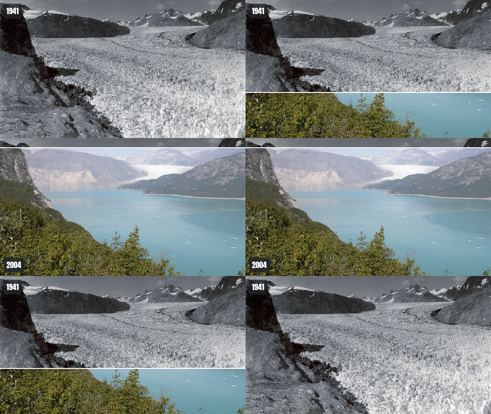
The pair comes from NASA's Muir Glacier comparison, using USGS photographs. The pictures are historical views, not two perfectly registered frames. The animation helps show the broad change; it should not be used to measure an exact retreat distance. Date labels are more useful here than generic Before and After captions.
A vertical scanner compares water levels
Lake Powell is a useful example of a comparison with many recognizable reference points. Follow a shoreline or an inlet while the horizontal divider moves up and down. The same location stays in view, so the changing outline of the water is easier to inspect than it would be in two images placed far apart.
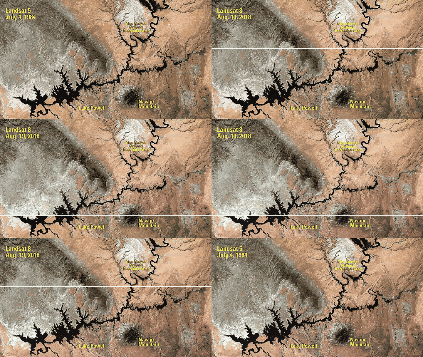
The Landsat images are from NASA's Lake Powell comparison. This approach also works for aerial views of construction, planting projects, or a changing site. Keep the map extent and orientation consistent so a shift in framing does not look like a change on the ground.
A horizontal scanner compares skin appearance
A vertical divider moves left and right across this portrait, making changes in visible redness and skin texture easy to follow. This format can introduce a beauty comparison in a product email or on a product page. Keep the pose, lighting, crop, and image processing consistent, and describe what the photos actually show rather than suggesting a result the images cannot establish.
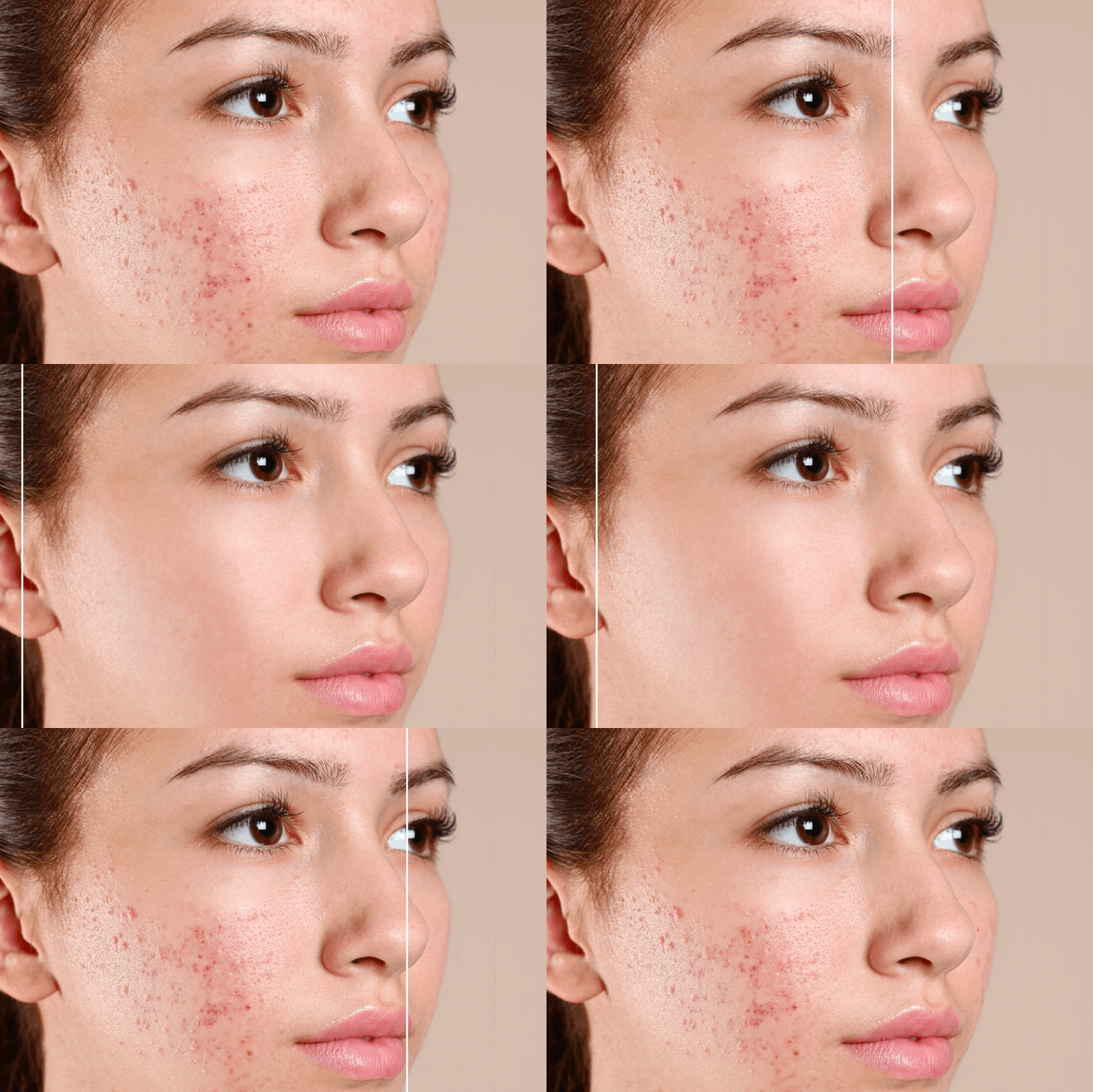
This is the same visual used in our guide to adding a GIF to an email. For a real skincare result, include the time between photos and any relevant treatment or editing context in the surrounding copy.
A horizontal scanner demonstrates sneaker cleaning
A left-to-right reveal lets viewers inspect the upper and sole of a white sneaker as muddy marks give way to a clean surface. A shoe-care store could use this type of comparison beside a cleaning kit or a short care guide, with the two full views held long enough to inspect.
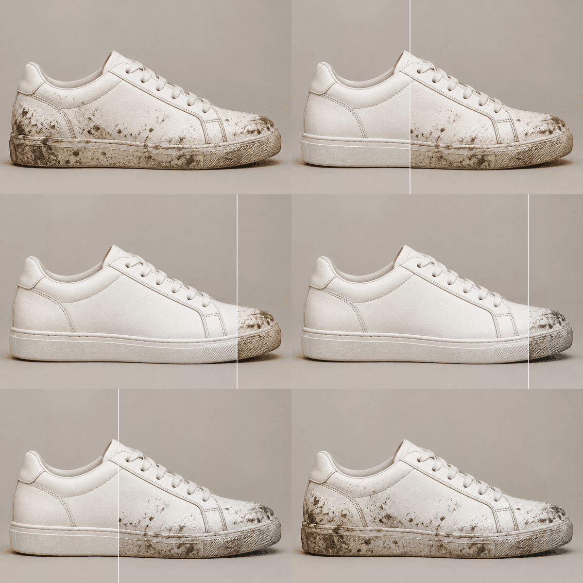
This example uses AI-generated images to illustrate the layout; it does not demonstrate a tested product result. For a product listing, replace them with your own before and after photos taken at the same angle and under the same lighting.
A dissolve shows photo colorization
A dissolve gradually replaces the whole photograph. It suits a comparison in which the composition stays nearly the same and the main change is color. There is no divider to follow; viewers can concentrate on the overall portrait or look at a particular area through the transition.
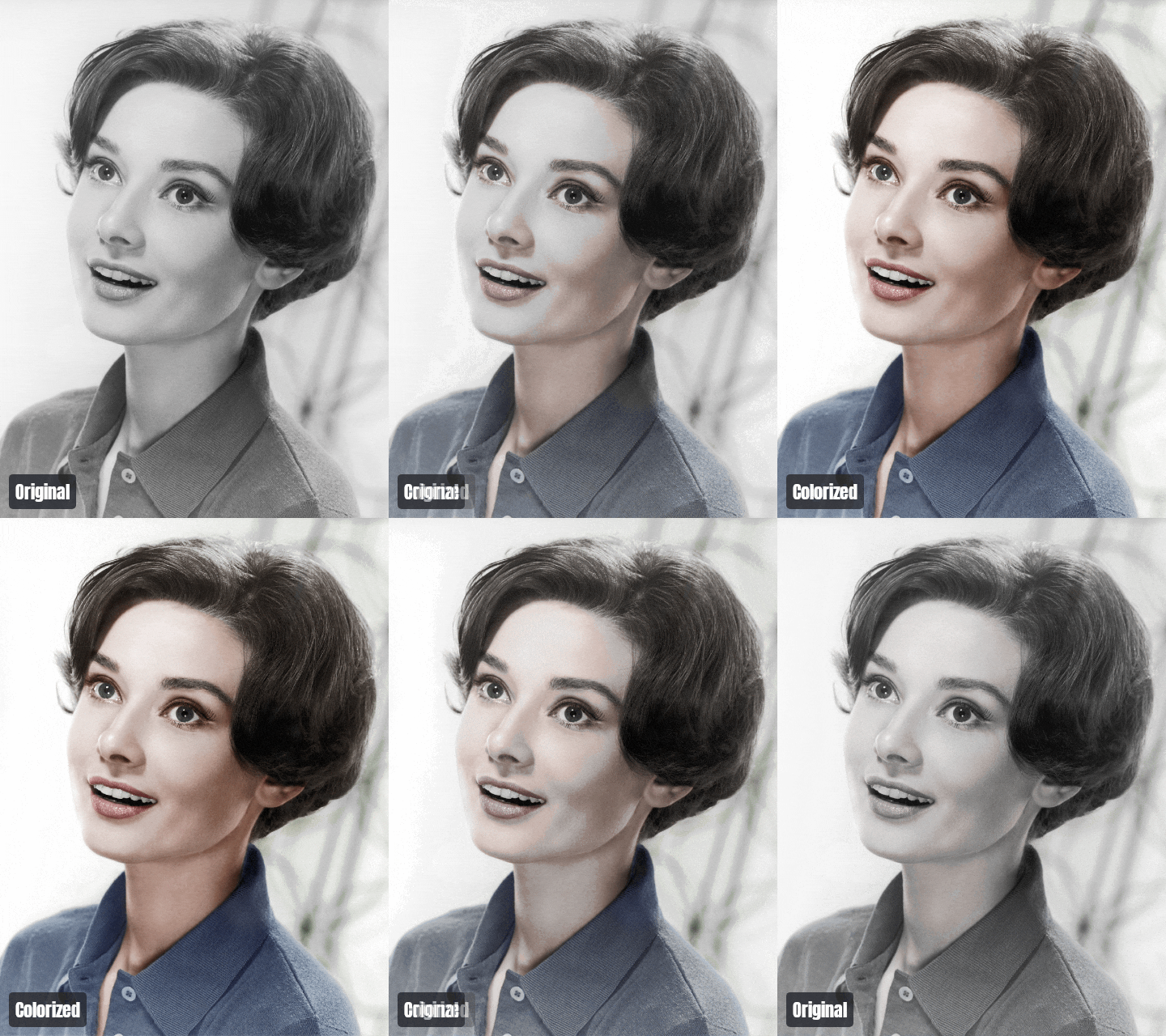
This example combines the 1959 MGM portrait with RubenVanKuik's colorized version. Both files are marked public domain on Wikimedia Commons. The colorization is an interpretation, not evidence of the original colors. For your own retouching portfolio, label the versions with the actual edit, such as Original and Color grade.


A Glitch transition introduces a large color change
A Glitch transition briefly offsets image bands and color channels, making the switch itself more noticeable. Use it when the overall difference matters more than inspecting a precise boundary. Leave enough time on the complete first and second pictures so the transition does not become the main event.
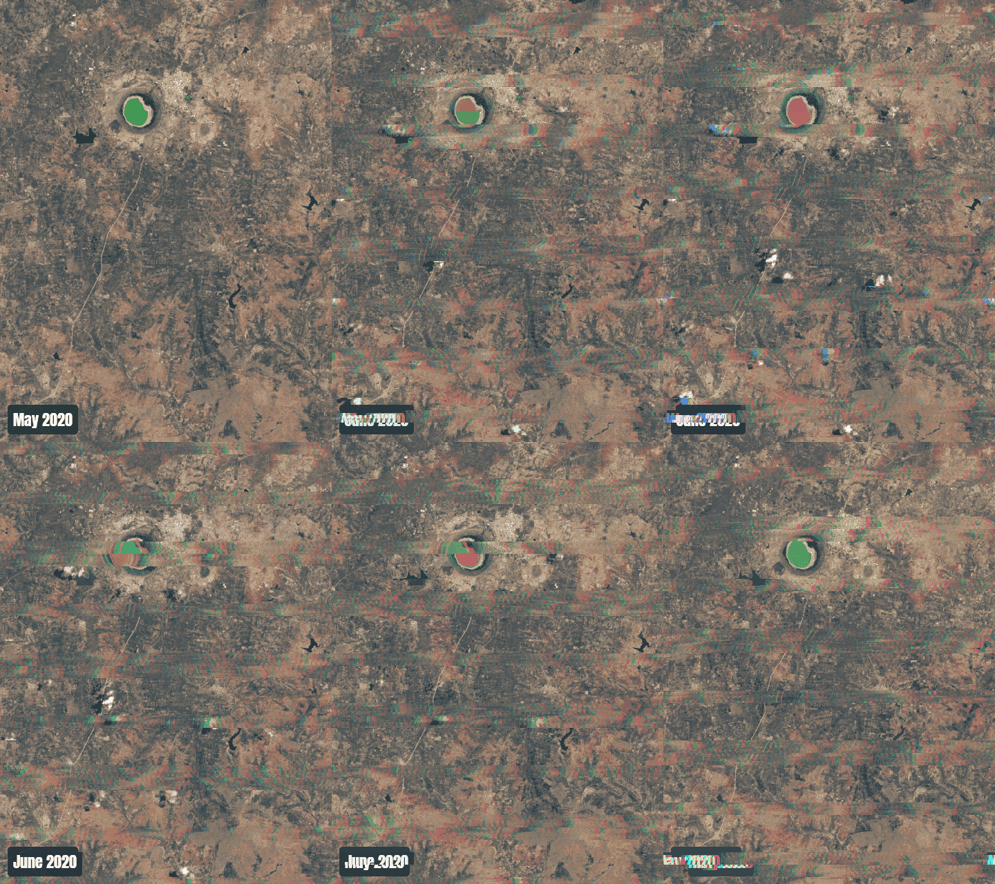
These images come from NASA Earth Observatory's Lonar Lake story, with imagery by Lauren Dauphin using USGS Landsat data. The two observations are from May 25 and June 10, 2020. The GIF presents a comparison of those dates; the transition does not depict how the water physically changed between them.
20 before and after GIF ideas
The examples above show four ways to reveal a difference. The same techniques can explain work, document progress, or teach a visual skill. For each idea, choose one specific result rather than trying to fit an entire project into two pictures.
Photo editing and creative work
1. Exposure and color grading. Export the original and finished edit with the same crop. Compare the shadows, skin tones, or white balance using a scanner or dissolve. Keep a short note beside the GIF explaining which adjustment you want viewers to notice.
2. Photo restoration. Show a damaged scan alongside the repaired version. A slow scanner can reveal removed scratches, rebuilt corners, and recovered contrast. Keep the resolution and framing consistent, and distinguish repaired damage from any newly invented detail.
3. Product photo cleanup. Compare a product shot before and after removing dust, distractions, or an unwanted background. Keep the item in exactly the same position. This makes the cleanup visible without suggesting that the product itself has changed.
4. Sketch to finished illustration. Compare a line drawing with its colored or shaded version. A dissolve works well when the main shapes line up; a split transition suits a more substantial redesign. Label the stages Sketch and Final rather than implying that the drawing was a flawed photograph.
Homes, spaces, and restoration
5. Kitchen or bathroom renovation. Photograph the room from a repeatable position, with a doorway or window as a reference. A horizontal scanner can reveal cabinetry and finishes across the space. If walls have moved, a whole-image transition may be easier to read.
6. Interior paint and wallpaper. Keep furniture and camera position unchanged so the surface treatment carries the comparison. Label a digital mockup as a visualization if it shows a proposed finish rather than completed work.
7. Real estate staging. Compare an empty room with a furnished view. Use captions such as Empty and Virtually staged when appropriate. Similar lighting and framing help viewers understand the furniture layout without confusing it with changes to the building.
8. Furniture restoration. Show the same chair, table, or cabinet before and after refinishing. Keep the object's scale consistent and use a background that does not compete with the surface. Add a closer comparison if the main change is in small joints or upholstery detail.
9. Garden and landscaping work. Compare a planting bed, lawn, or patio from the same vantage point. Include dates when growth or seasonal conditions explain part of the difference. A scanner lets viewers follow paths, borders, and planting areas through the reveal.
Services and progress updates
10. Pressure washing. Use a wide comparison for the overall driveway or patio, then a separate close-up if texture matters. Try to photograph the surface under similar conditions: a wet After image can make color and contrast look different from a dry Before image.
11. Vehicle detailing. Compare the same panel, seat, or wheel before and after cleaning. Match the angle and light, especially when showing gloss or scratches. A moving reflection can overwhelm the difference you intended to demonstrate.
12. Haircuts, styling, and grooming. Use a consistent pose and background. A full-image dissolve often reads more naturally than a scanner when a head or body has moved. If the pair will not align, let viewers see each complete photo rather than forcing the contours together.
13. Workshop repairs. Show an object before and after a repair, with the affected part large enough to see. A slow reveal can explain a repaired seam, replaced component, or restored finish. Keep a brief text description of the work beside the animation.
Design, products, and teaching
14. Website redesign. Capture the same page at the same browser width and scroll position. Compare one section, such as the navigation or product card, rather than shrinking an entire long page into a GIF. A scanner makes spacing and layout changes easy to trace.
15. Packaging revisions. Put both designs on the same mockup or photograph them at matching angles. Compare hierarchy, typography, or label placement one change at a time. A short hold on each version gives readers time to inspect the text.
16. Presentation slide cleanup. Show a dense slide and a clearer revision at the same dimensions. Keep the message equivalent so the audience can judge the layout change. Use enough output width for the key heading and chart labels to remain readable.
17. Drawing or craft lessons. Compare two stages of shading, embroidery, painting, or model-making. Name the actual stages, such as Base layer and Highlights. If the intermediate steps are essential to the lesson, use a slideshow instead of compressing them into a two-image reveal.
Changes across time
18. Construction progress. Photograph the site from a fixed viewpoint on two dates. A scanner can reveal the structure as it develops, but labels should say which stage each image represents. For a longer sequence, collect several visits in a slideshow GIF.
19. Seasonal and environmental changes. Compare snow cover, water levels, tree canopies, or a familiar landscape across dates. Keep the location and framing consistent, and explain what the images show without inferring an unsupported cause from the pictures alone.
20. Organization and workspace resets. Show a desk, storage shelf, studio, or workshop before and after reorganizing. Use the same camera height and crop. This works especially well when the result demonstrates a practical change, such as a cleared work surface or easier access to tools.
How to make a before and after GIF
Choose two photos that explain one change
Start with a pair that already makes sense side by side. Use matching viewpoints, similar subject size, and enough resolution for the final placement. When showing edits to one photo, export both versions with the same crop. For a physical project, repeat the camera position as closely as possible.
Avoid relying on a transition to repair a weak pair. A new camera angle, a different pose, or a large exposure shift can distract from the actual result. If several images are needed to explain the sequence, our guide to making a GIF from images covers that approach.
Upload the images and set the frame
Open the Before and After GIF Maker and add the two photos in their respective image slots. Each upload can be up to 5 MB. Check the order and swap the photos if the result begins with the finished version.
Choose an Aspect that keeps the important detail visible. The photos fill the selected frame, so some content may be cropped. Automatic alignment can help with suitable image pairs, but inspect fixed edges yourself: a doorway, outline, or horizon should not unexpectedly shift through the reveal.
Choose a style and give each image time
Select a horizontal scanner, vertical scanner, or Transition. Try the scanner or Wipe for an aligned comparison, Dissolve for a color change, or explore Slide, Cover, Zoom, and the other transition families for a more expressive reveal. Set Delay to give viewers time to inspect each complete photo; in scanner mode, Interval controls how long the sweep takes.
As a starting point, try about one second on each complete view and a scanner sweep of roughly one second. Increase the hold if the image has several details or a date label to read. These are practical starting values, not a requirement. Watch the result at its intended display size before deciding it is fast enough.
Use short captions and a position preset
Replace Before and After with useful labels when the context needs them: dates, Original and Edited, or Sketch and Final. Keep both captions short and give them enough contrast against the picture. The text beside the GIF can explain the details.
Choose an Alignment preset after choosing the reveal style. Scanner presets place the two labels on corresponding sides of the comparison; a transition uses one anchor for the changing caption. Watch both the forward and return sweep to make sure the labels stay in sensible positions and do not cover the result.
Export and check the saved file
Open Download and choose GIF for a destination that accepts animated images. MP4 is available for placements that expect video; animated WebP is another option when the destination supports it. Adjust width, frame rate, and quality, then inspect the exported file as well as the editor preview.
A small comparison does not need the dimensions of the original camera image. Start near the width at which the animation will appear, then check edges and labels. The GIF frame rate guide explains how FPS changes motion and file size. If the result needs further optimization, try the GIF Compressor and compare the output with the original.
Where to use the finished comparison
On a portfolio or case-study page, put the GIF beside a short explanation of the work. Let the animation demonstrate the visible change while the text describes what you did. Avoid making the caption carry the whole project story.
For email, check the actual received message. Some viewers show a still frame, so the first image and surrounding text should still make sense without motion. Our guide to adding a GIF to an email covers the placement and testing steps.
For a presentation or social post, choose the format the destination accepts and preview it there. A GIF preview in your browser does not tell you how a separate service will display or convert the upload. Keep a static comparison available if the animation is not supported.
Check these details before publishing
- Make the change clear in one loop.
- Match the framing and keep important details visible.
- Identify dates, stages, and digital edits where needed.
- Give viewers time to inspect both photos.
- Keep captions readable and consistently positioned.
- Check the GIF at mobile size.
- Make the first frame understandable without animation.
Choose a strong pair before choosing an elaborate effect. A simple reveal of the right two pictures usually explains more than a busy transition between mismatched views. Start with the Before and After GIF Maker, compare a couple of styles, and keep the version that makes the change easiest to understand.
Frequently asked questions
How do I make a before and after GIF from two photos?
Upload the images to the Before and After GIF Maker, choose a scanner or transition, and set the timing. Add short captions, check the framing, then open Download and export as GIF.
What is a good idea for a before and after GIF?
Choose one visible change in the same subject: a photo edit, room renovation, restored object, cleaned surface, design revision, or landscape photographed on two dates. Similar viewpoints make the comparison easier to understand.
What is the difference between a horizontal and vertical scanner?
Here the names describe movement. A horizontal scanner has a vertical divider moving left and right. A vertical scanner has a horizontal divider moving up and down.
Is a before and after GIF an interactive slider?
No. The GIF plays a recorded reveal automatically. Viewers cannot drag its divider. An interactive slider is a separate website component that lets readers choose the comparison position.
Why do the photos jump during the comparison?
Different crops, camera angles, subject positions, or scales can make the scene shift. Use similar source images and check alignment. A dissolve or simple cut may suit different poses better than a scanner, but it does not actually align them.
How long should a before and after GIF be?
Use enough time to see each complete image and follow the reveal. About a second per complete view and a roughly one-second scanner sweep are useful starting points. Extend the holds for detailed comparisons, then watch a full loop at the final display size.
Can I export the comparison as a video?
Yes. Choose MP4 in Download to export the two-photo comparison as a video. GIF and animated WebP are also available. Use the format accepted by the place where you plan to share it.
Can I show more than two stages?
The Before and After GIF Maker compares two images. For three or more stages, use the GIF Slideshow Maker and give each stage its own frame.