Fashion banners for collections, sales and new arrivals
Build a campaign around the clothes and the reason to shop. Seven editable examples show how to combine product photography, clear offers and animation for collections, sales and accessories.
A fashion banner has a small space to do several things. It has to show the clothes clearly, make the collection feel desirable, and tell someone why to look now. Put a large discount over the outfit and the product disappears. Leave only a beautiful photograph and the offer may disappear instead.
The useful starting point is the shopping decision. Are you introducing a new collection, helping someone picture an outfit, or giving them a reason to return for a pair of boots? That decision tells you which photograph should lead, what the headline should say, and whether changing the image adds anything.
This guide walks through seven fashion banner examples, then shows how to choose photographs, write the offer, adapt the format, and assemble your own version. Each example opens in Fashion Banner Maker with its photos, text, colors and timing ready to edit. The brands, discounts and codes shown are sample campaign copy.
Choose the campaign before choosing the layout
A banner for a new collection needs a different emphasis from a clearance announcement. The collection needs a recognizable mood and a reason to explore. Clearance needs an understandable offer and enough product detail to make it worth opening. Trying to deliver both messages equally often produces a crowded design with no clear starting point.
Write down the collection or product, the reason to shop, and the destination before opening a template. For example, “weekend boots, 35% off selected styles, boots collection page” is a usable brief. “Promote the store” leaves every design decision unresolved. Keep the promise consistent with the page people reach: a banner about linen shirts should lead to linen shirts, with the advertised offer visible there.
| Campaign | Let the photo show | Let the copy explain |
|---|---|---|
| New collection | The silhouette, styling and mood | What has arrived and where to explore it |
| Seasonal sale | Products included in the offer | The discount, scope and end date |
| An outfit or edit | Pieces that belong together | The occasion or idea connecting them |
| Accessories | Scale, material and useful details | What makes the item worth a closer look |
| Promo-code offer | Eligible products | The code and the conditions for using it |
| Weekend promotion | A focused selection | What is special about this offer now |
A small collection of coordinated banners is easier to manage than one design trying to carry every message. You can reuse the photographs and colors while changing the main offer for a launch, a reminder, or the final days of a sale.
Seven fashion banner examples you can edit
A swimwear sale with room for the product
The orange panel in this example makes the offer immediately visible, while the blue swimwear gives the photograph its own strong color. The two areas have different jobs. The text explains the sale; the model shows the fit. Neither needs to sit on top of the other.
The photo sequence stays with one swimsuit and changes the view. That makes the animation useful: a shopper can see more of the same item without having to work out whether the offer has changed. For your own version, choose a front view, a different pose, a closer detail and a back or side view. Keep the crop wide enough to preserve the part of the garment you are selling.
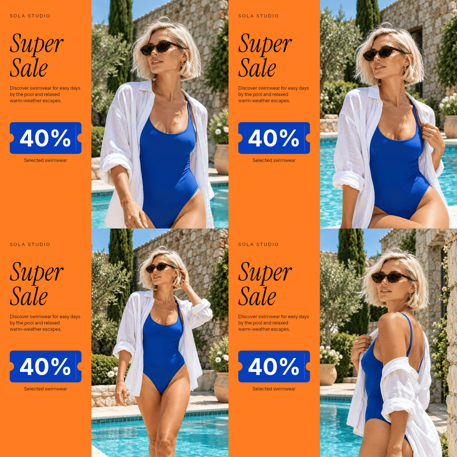
“40% off” is only helpful when the scope is clear. If the offer covers selected swimwear, keep that qualification beside the discount. Avoid adding a second percentage, a shipping promotion and a membership offer to the same panel. Those details can live on the destination page, where there is room to explain them.
A clothing edit that feels like a collection
The dark background, restrained headline and bright accent in this menswear banner give the photographs a shared identity. This is a useful approach when the point is a collection: everyday layers, travel clothes, or a compact work wardrobe. The items do not have to be identical, but they should look as though someone selected them for the same reason.
Build the sequence around that reason. An everyday edit might move from a complete outfit to a jacket detail, then to a second look using the same palette. Keep the words stable while the photos change so the reader does not have to start again with every frame. This template includes a discount; you can replace the sample offer with your own collection message in the editor.
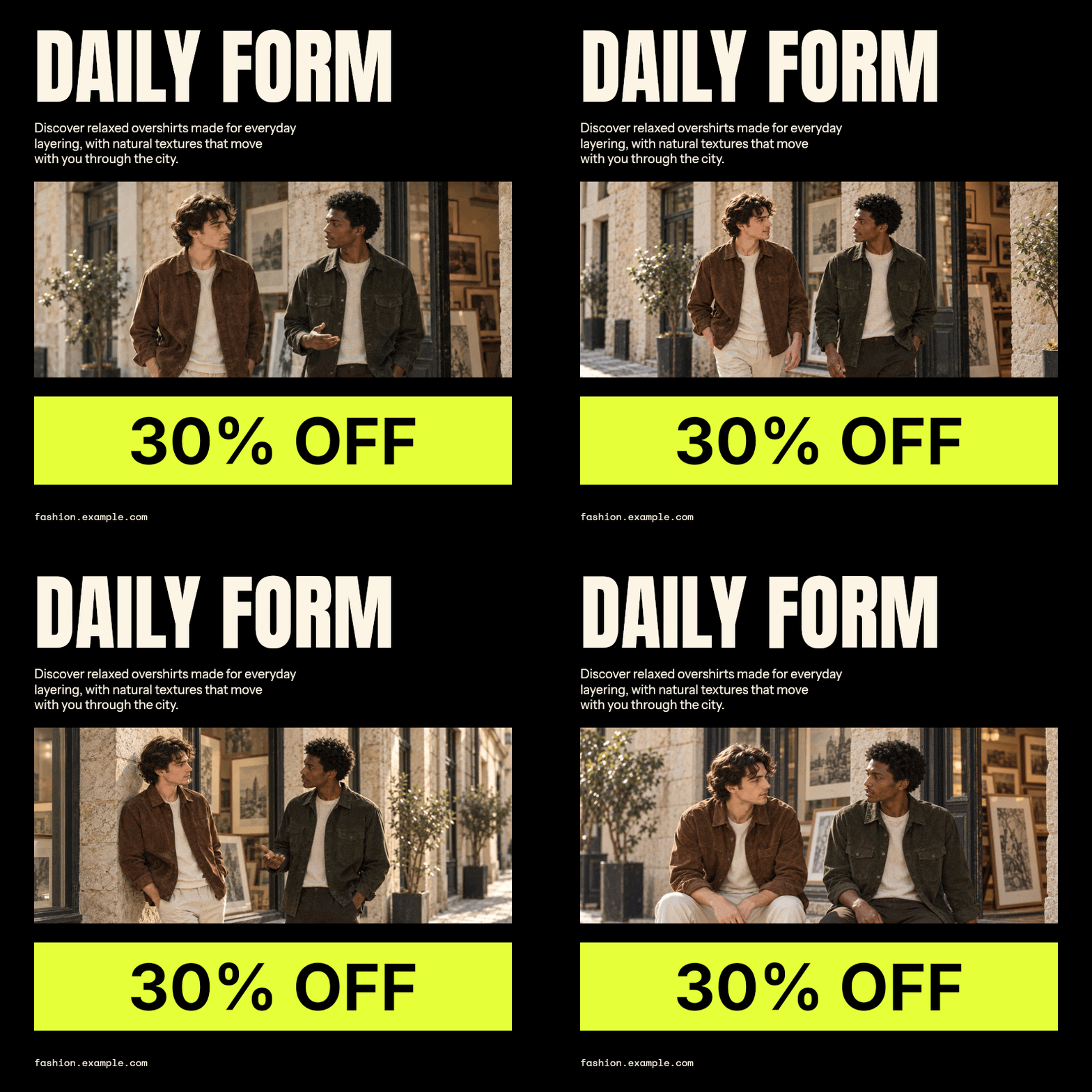
For a launch, use a headline such as “The everyday edit” and a supporting line that names what is new. A launch does not need a discount to be understandable. What matters is that the photos and the promise agree: a banner about lightweight summer layers should not alternate between beachwear and winter coats just because both photographs look good.
A sneaker banner that makes details worth watching
A sneaker purchase can depend on the shape, sole, texture and how the shoe looks on a foot. A sequence of photographs gives those details a place without turning the banner into a product specification sheet. Start with the view that best identifies the shoe, then use the remaining images to answer a different visual question.
The light background in this example keeps the shoes distinct, and the red offer gives the composition a clear accent. With a pale product, check that the edge of the shoe remains visible against the photo background. With a dark product, watch for lost texture in the exported GIF, especially around the laces and sole.
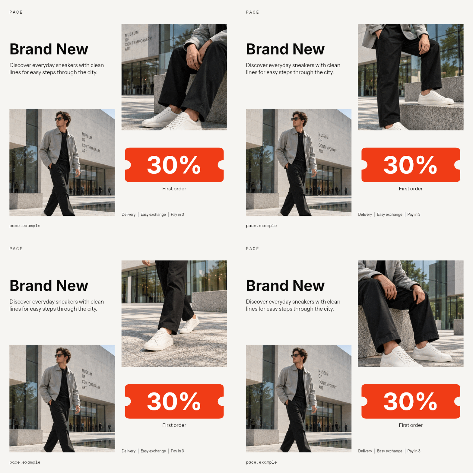
Keep the shoe roughly the same apparent size when moving between similar angles. A sudden jump from a distant full-body photo to an extreme close-up can work as a deliberate reveal, but repeated accidental changes in scale make a product sequence harder to follow. If you have just two strong views, use those rather than filling the animation with weaker photographs.
A watch promotion built around a small ritual
Accessories often benefit from context. A watch photographed on a wrist tells you something about scale and styling that an isolated product shot cannot. The café imagery in this example gives the watch a setting, while the quiet typography leaves room to notice it.
Use the lifestyle photograph to introduce the item, then make sure another view shows the actual product clearly. A cup, sleeve or table can help set the scene, but it should not become the most memorable thing in a watch advertisement. The same approach works for jewelry, sunglasses and small leather goods: show how the object belongs in someone's day, then give them a useful view of it.
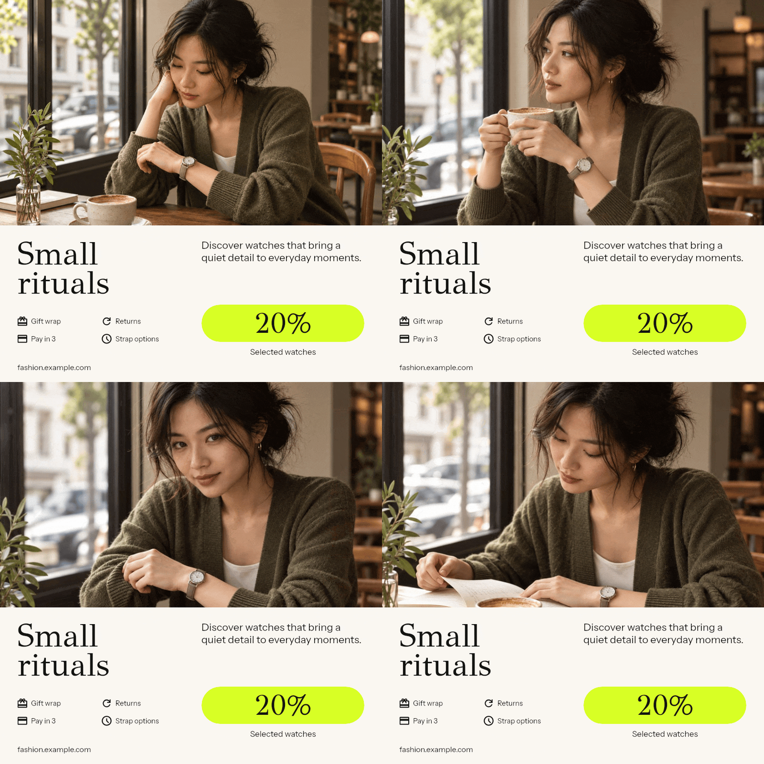
A short headline can carry the mood, while the supporting text names the product or offer. “Small rituals” works because the photograph provides context. On a less specific image, add a concrete line such as “Everyday watches, selected styles” so the banner still tells a new visitor what the store sells.
Fresh accessories in a brighter palette
The pale green background and red accent make this bag banner feel different from the watch example without needing a complicated animation. The photographs carry the texture and shape of the bags; the surrounding design supplies the campaign color. This is useful for a spring accessories edit, a new color drop, or a small selection of everyday essentials.
Choose images that reveal something across the sequence. One can show the bag carried, another its shape, and another a detail such as the handle or opening. If the campaign is about color options, use the same angle for each color so the change is easy to compare. If it is about capacity, include a photograph that actually shows the interior rather than making that claim with styling alone.
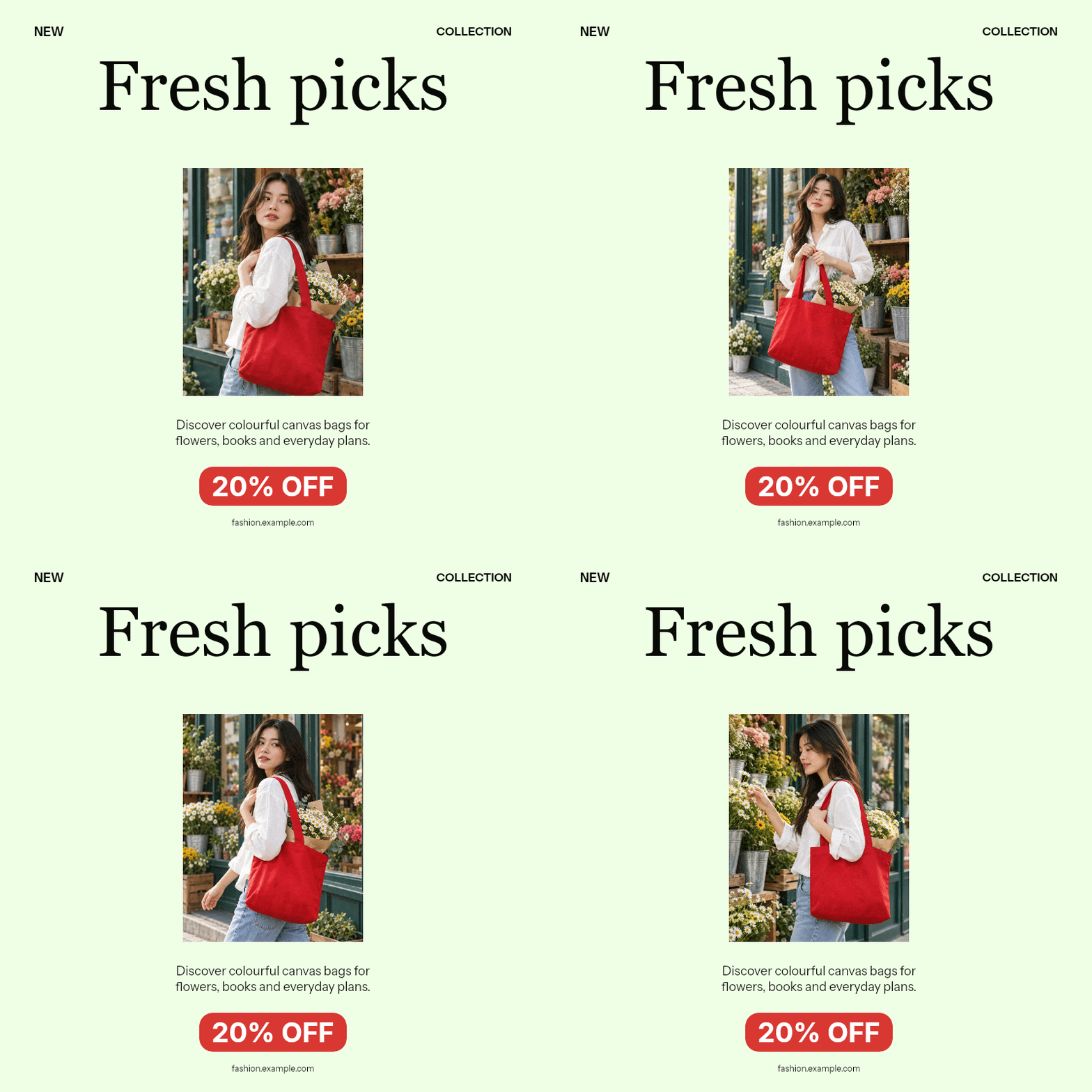
Keep product colors believable. You can change the background and text colors in the banner editor, but the item itself should still look like the one someone will receive. Strong campaign colors are most useful around the photography, where they can add personality without obscuring the merchandise.
A weekend offer with an editorial feel
Black-and-white photography gives this boots banner a different character from the brighter examples. The red discount tag remains the strongest color, and the short “Weekend special” headline connects the offer to a familiar shopping moment. It feels composed because the type, photograph and offer each have their own space.
The changing images stay with boots and city styling. For a similar campaign, choose photographs that share a location, light or outfit so the banner reads as one story. A monochrome treatment is particularly useful when shape and styling matter more than the exact product color. If color is a deciding feature, include accurate color photography on the linked product page and consider using it in the banner too.
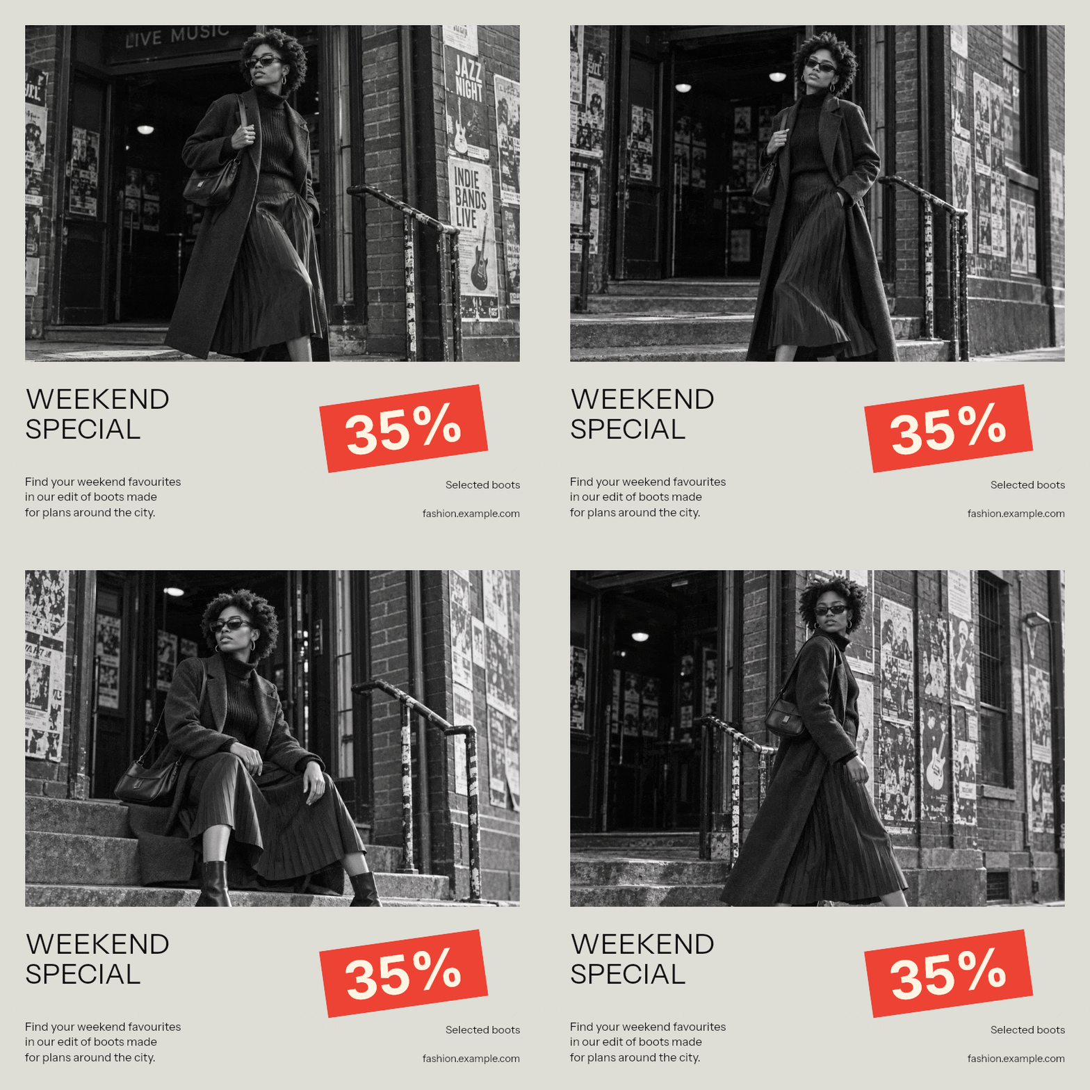
Make the time limit concrete in your own copy. “Until Sunday” is easier to act on than a permanent “Limited time” label, provided the campaign really ends then. When the offer expires, update or remove the banner wherever it appears. A polished visual cannot rescue a promotion that no longer matches the store.
A flash sale with a code people can read
The yellow and blue treatment makes this outerwear offer deliberately loud. That is appropriate for a short promotion where the discount and code are the main message. It would be a different choice for a quiet collection launch, which is why a template should follow the campaign rather than dictate it.
Give the code a stable position while the photographs change. A visitor should not have to catch one brief frame to learn how the offer works. Keep the code short, avoid ambiguous characters where possible, and repeat it as ordinary text beside the banner or on the destination page. Words inside a GIF are part of the image and cannot be selected and copied as text.
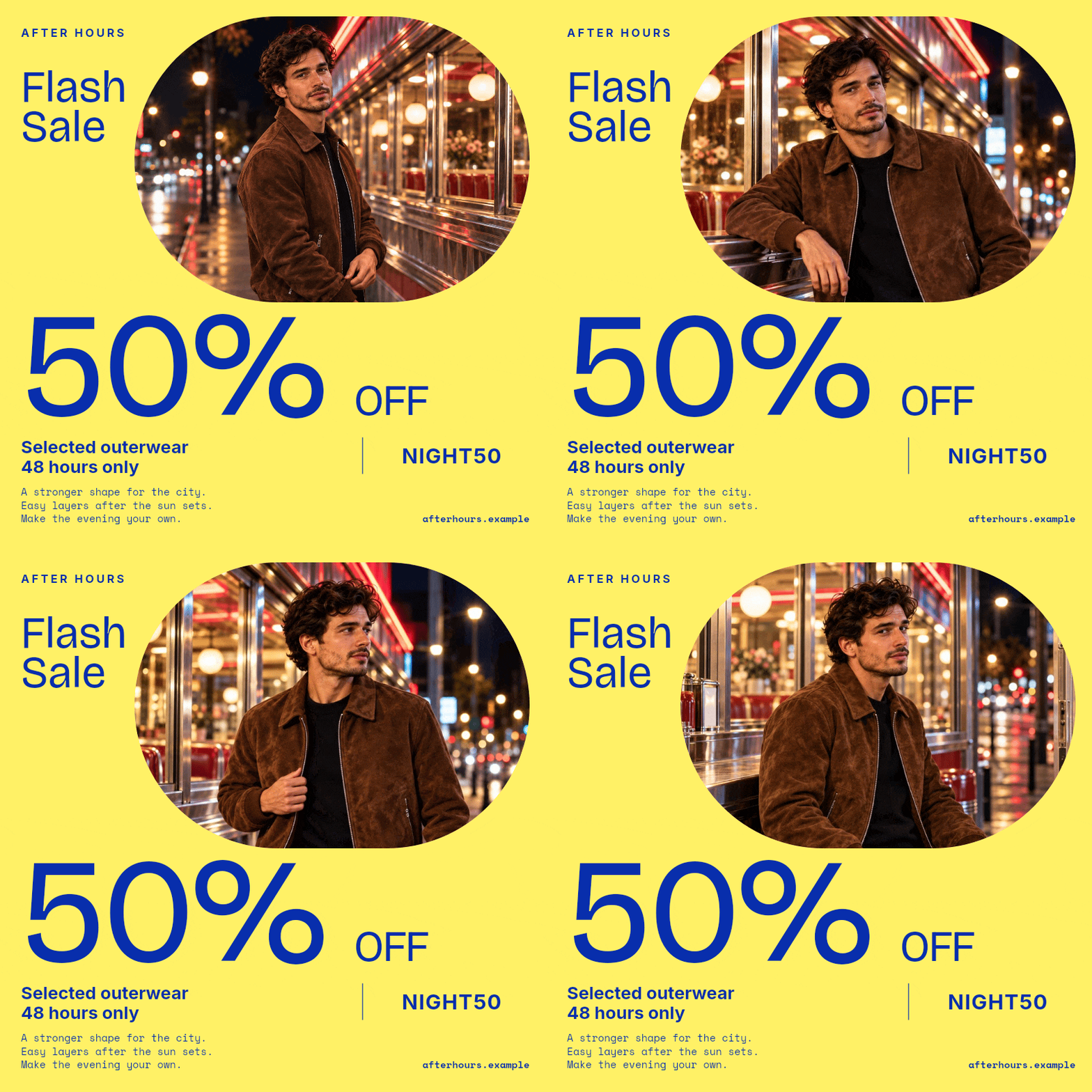
If the code applies only to a collection, say so near the offer. If the discount is automatic, do not invent a code just to fill the template. Use the space for a useful qualification or a short invitation to explore the eligible products.
Choose fashion photographs that work together
A banner usually shows a smaller version of your photography than a product page. Fine details, subtle contrasts and distant subjects can disappear. Judge the selection at approximately the size it will be used, not only in the large editor preview. The first image should identify the product or collection without needing the rest of the animation.
For a single item, a good starting sequence is the clearest view, an alternative angle, a detail and the item being worn. For a collection, choose several looks connected by an occasion, color palette or styling idea. You can build richer moving collections with GIF Slideshow Maker, but a sale banner generally needs fewer photographs because the text also asks for attention.
Keep the subject in a consistent part of the frame. If the template shows photos on the right, check each crop against that shape. A portrait that works beautifully on its own may lose the shoes when placed in a square photo window. Replace or adjust the photo rather than relying on a viewer to infer the missing product.
Use photography you have permission to publish. Avoid mixing clean product images with screenshots containing prices, navigation or old promotional copy. Those extra details become tiny, competing messages inside the new banner, and they are difficult to update when the offer changes.
Make each new frame earn its place
Two nearly identical poses can make a subtle sequence, but a long run of them rarely explains more about the clothing. Ask what each frame adds. A second angle may reveal the back of a dress. A detail may show the knit. Another outfit may demonstrate how the same jacket can be styled.
You do not need to animate every asset. A single strong photograph can carry a clear offer. Use multiple photos when they help someone assess the item or understand the collection, and keep the campaign text consistent while they change. That gives the viewer one stable message and one changing visual element.
Write banner copy that fits the space
Start with the headline, one supporting idea and the offer. A headline names the event or collection. Supporting text makes it specific. The offer gives the discount, code or next step when there is one. If two lines do the same job, remove one and give the photograph more room.
“New season” is a starting point, but “Light layers for warmer days” says more about the clothes. “Sale” announces a promotion; “25% off selected jackets” explains it. The best wording depends on the visual: an obvious sneaker photograph needs less product explanation than an atmospheric street scene.
| What the banner needs to say | A clearer starting point |
|---|---|
| A collection has arrived | “Meet the linen edit” |
| Selected products are discounted | “30% off selected sneakers” |
| The offer has a real deadline | “Weekend prices. Ends Sunday.” |
| There is a checkout code | “Use NIGHT50 on selected outerwear” |
| The campaign is about an occasion | “Dressed for the long weekend” |
| The destination is a curated selection | “Explore the everyday edit” |
These are writing patterns, not claims to reuse without checking. Replace every percentage, code and deadline with your actual offer. Check that the currency, product names and conditions agree with the landing page. Keep any essential qualification readable; shrinking it until it becomes decorative defeats its purpose.
A button-shaped element inside an exported GIF is still part of the picture. On a website or in an email, link the banner through the publishing tool. The drawn button does not create its own separate clickable area. For email placement, the guide to adding a GIF to an email explains how to insert and link the image.
Where to use fashion banners and which sizes to prepare
A store homepage, an email and a story have different jobs and different shapes. The homepage banner introduces a collection before someone starts browsing. An email banner reminds a subscriber about a specific offer. A social placement has to make sense among other posts, with the platform's buttons and captions around it. Prepare the campaign for the space it will actually occupy rather than uploading the same file everywhere.
Separate three decisions. The aspect ratio describes the shape, such as 4:5. Pixel dimensions describe the resolution, such as 1080 × 1350. The file format determines whether you deliver an animated image or a video. A 720 × 900 banner and a 1080 × 1350 banner share the same 4:5 composition; the larger file does not give the design more room for words when both are displayed at the same size.
| Placement | Useful shape | Example export dimensions | What matters most |
|---|---|---|---|
| Store homepage or collection introduction | Landscape 3:2 | 1200 × 800 | Match the theme's banner slot and check its mobile crop |
| Square promotion beside a product grid | Square 1:1 | 1080 × 1080 | Keep the offer readable without overpowering the products |
| Portrait social feed creative | Portrait 4:5 | 1080 × 1350 | Show the outfit and keep the main message legible on a phone |
| Full-height story or short-video creative | Vertical 9:16 | 1080 × 1920 | Leave space for account details, captions and action buttons |
| Sale email | Landscape 3:2 | 1200 × 800, displayed around 600 × 400 | Balance sharpness, loading time and a useful opening frame |
| Uploaded display advertisement | Exact slot dimensions | For example, 300 × 250 or 300 × 600 | Meet the ad network's size, file-weight and animation rules |
The export sizes above are starting examples, not universal upload requirements. Your website theme defines its own image areas, and advertising specifications depend on the chosen placement. Check the actual upload form and preview before publishing; an aspect that is accepted in one placement may be cropped in another.
On your store: match the banner slot and the mobile layout
Use a homepage banner to introduce a collection, a seasonal offer or a new arrival, then link it to that selection. On a collection page, a smaller banner can explain the promotion while leaving room for the product grid. Keep the offer consistent with what someone sees immediately after clicking.
Check how your theme displays the media. Some sections show the complete image and let its height follow its width. Others fill a fixed-height area and crop the edges. A wide banner may look fine on a laptop but lose the discount or product when the same slot becomes narrow on a phone. If the theme supports separate desktop and mobile media, prepare a landscape version and a portrait or square version from the same campaign.
A downloaded GIF does not rearrange its text as the browser gets narrower. It scales as one finished image. Changing the aspect in the editor creates a new composition before export; the website then chooses which exported file to display. Increasing resolution can improve sharpness, but it cannot make tiny wording larger relative to the rest of the design.
In email: keep the first frame useful and the file light
A sale email can use a banner to show several views of the featured item while the offer remains visible. Repeat the code and shopping link in ordinary email text so they remain usable even if the image does not load. Link the banner through your email builder, rather than expecting a button drawn inside the image to act as a separate link.
For a concrete reference, Mailchimp recommends image files no larger than 1 MB and widths of 660–1320 pixels for its new builder, or 600–1200 for its legacy builder. These are Mailchimp's recommendations, not a limit shared by every email service. Start near your content width, compare a higher-resolution export if needed, and inspect the file size before sending. Mailchimp's image recommendations.
Some email clients do not play animated GIFs. Put the product and offer in the opening frame, then use the following photos to add detail. Send a test email to inspect the actual result; a browser preview alone cannot show every inbox's behavior. Mailchimp's HTML email limitations.
In social feeds and vertical placements: prepare the crop and the export
Use the 4:5 and 9:16 examples above as composition starting points for feed and full-height creative. For an animated placement, export MP4 when the publishing tool expects video. Do not assume that a GIF accepted by your email service will be accepted by the same platform's advertising uploader.
For example, TikTok's Non-Spark auction in-feed specifications recommend vertical 9:16 video at a minimum of 540 × 960 pixels and accept MP4. They also specify a maximum file size of 500 MB and a minimum bitrate of 516 kbps. The editor's aspect setting addresses the shape; the finished file must still meet the destination's other requirements. TikTok's in-feed ad specifications.
Leave important copy away from the areas covered by the platform's own interface. Safe areas depend on the placement and its captions or overlays, so inspect the publishing preview with those elements visible. A tall banner with a website address at the very bottom may need that detail moved or removed before publication, even when its dimensions are correct.
In display ads: an accepted ratio is not enough
Uploaded Google Display image ads use specific dimensions, including 300 × 250 and 300 × 600, and have a 150 KB file-size limit. Animated GIF ads must run below 5 frames per second and stop within 30 seconds, including repeats. These requirements apply to uploaded image ads; other Google ad formats have different specifications. Google's uploaded display ad specifications.
The looping GIFs in this article are demonstrations, not ready-to-upload Google Display ads. Making a six-second loop does not satisfy a requirement to stop after 30 seconds if it repeats forever. Prepare an export with the required dimensions, weight and playback behavior before using that placement. If you cannot meet them without making the product or text unclear, use a suitable still creative or another supported ad format.
One fashion banner adapted to three shapes
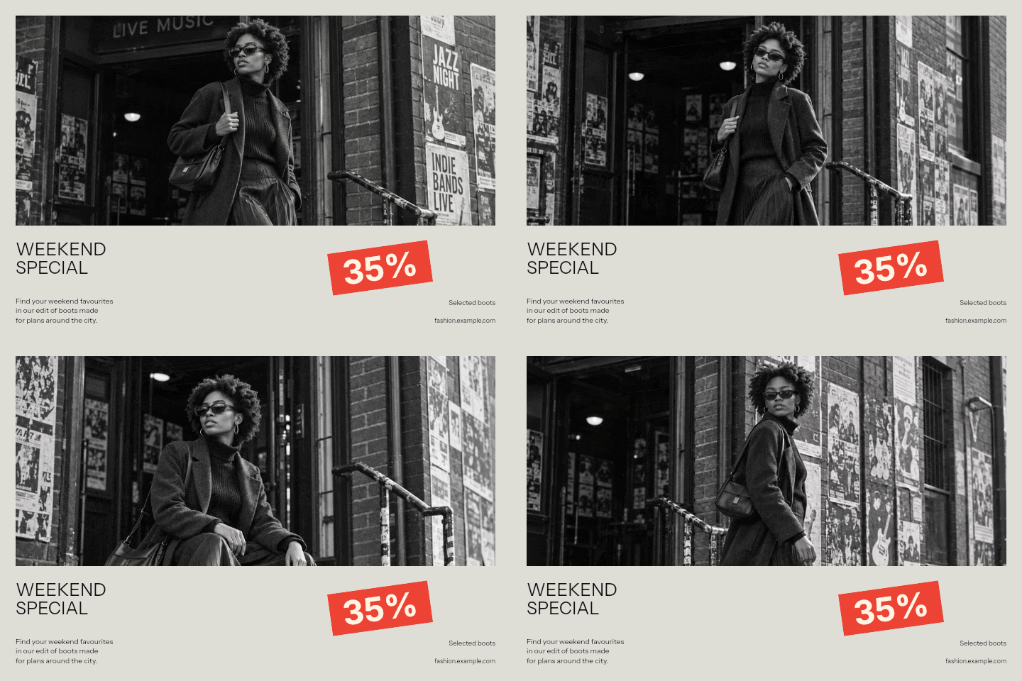
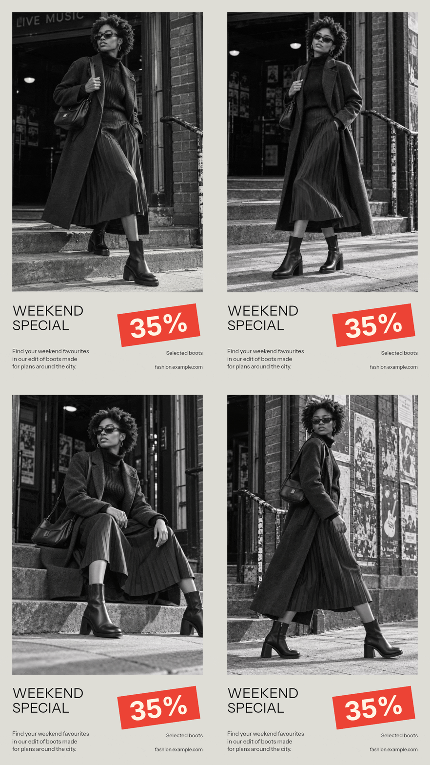
These versions use the same Weekend Special template, four photographs, wording, colors and 1.5-second delay. Only the aspect changes. Open any version to see its settings in the editor. The GIFs here are sized for the article; choose the export resolution required by your own placement when downloading.
Landscape 3:2: a wide campaign panel
The photograph becomes a shallow, wide window and the headline and offer spread across the lower panel. This fits a horizontal section, but it also exposes a problem with these particular photos: the boots are cropped out. The composition fits the canvas, yet it is no longer a useful advertisement for the product named in the copy. For a real landscape boot campaign, replace these full-length portraits with wider photographs that keep the boots visible, or use the portrait version below.
Portrait 4:5: keep the whole outfit visible
The taller photo area now shows the boots and the outfit together. The headline, description and discount remain underneath, with enough width to sit beside one another. This is the stronger version for this particular campaign because the image supports the offer instead of hiding the item being advertised.
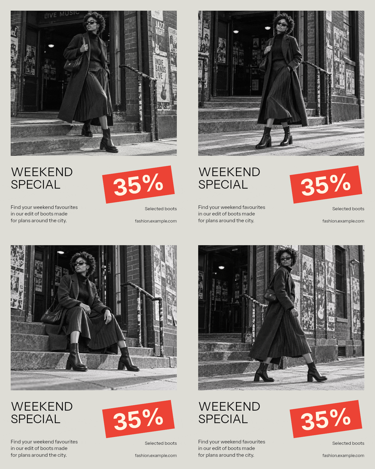
Vertical 9:16: use the extra height deliberately
The same template extends into a tall format, giving the photograph much more vertical space while keeping the offer below it. The model stays in proportion; the original square is not stretched. Before using this version in a story or video placement, check the bottom details against the platform's buttons and captions, and export a supported video format if required.
To make your own set, choose the aspect beside Template, inspect every photograph, and save that version before selecting the next shape. Keep the campaign message consistent, but change a photograph or shorten a line when the new layout needs it. Automatic adaptation provides a composition to work from; the final check is whether the product and offer still make sense together.
Choose GIF, MP4 or WebP for the destination
| Format | A useful starting use | What to check |
|---|---|---|
| GIF | An animated banner in an email or image-based web section | File weight, gradients and fine fabric detail; some inboxes show a still frame |
| MP4 | A social video placement or a website video section | Upload requirements, playback behavior and the surrounding interface |
| Animated WebP | A website section that supports animated WebP | Support in the actual site builder and any image-processing service it uses |
GIF works well for a short photo sequence, but its limited color palette can make subtle gradients or fabric textures look rough. MP4 often delivers photographic animation in a smaller file, though it needs a video-capable placement. Animated WebP is another option for websites; test the published result rather than assuming a builder preserves animation just because it accepts the upload.
Export the same short sequence in the formats your destination supports and compare the actual files. Look at faces, dark clothing, fine patterns and the smallest lettering at the intended display size. Keep the clearest version that fits the placement's requirements, and avoid using a much larger export simply because the source photos are large.
Make a fashion banner in the editor
1. Start from the closest example
Open an example above or choose a template in Fashion Banner Maker. Pick the composition for the material you have: a large discount, an editorial photo, or a compact product message. Choose the aspect early so you can assess the photographs in the shape that will be exported.
2. Add your photos and check the sequence
Replace the sample photographs with your own and arrange them in the order you want. Play through the whole sequence. Look for cropped shoes, cut-off bags, sudden changes in subject size, and images that show a different product from the one named in the offer. Keep only the views that improve the campaign.
3. Replace the sample text
Update the headline, offer, supporting copy and website information. Do this before fine-tuning colors: real copy can be longer than the sample and change the balance of the design. If a headline looks cramped, shorten it before trying to make everything smaller. Check the full banner for any sample details you have missed.
4. Set the colors and photo timing
Choose colors that work with the collection and leave enough contrast for the text. Start with a neutral background or one campaign color, then use an accent for the offer. The examples here use None for the transition and a Delay of 1.5 seconds per photo, so the images change directly while the message stays in place.
A softer transition can suit a slower editorial sequence. Try it with your actual photos and watch for an awkward overlap of faces or garments. Faster is not automatically more engaging: the viewer still needs time to recognize what changed. If the text changes between campaign versions, allow enough time to read the longer message.
5. Export and inspect the actual file
Open Download, choose the format and save the result. View the exported file at the size it will appear in your page, email or post. Check the opening frame, every photo change and the return to the beginning. A readable preview can become less clear after a publishing platform resizes it.
If the GIF is too large, first consider whether you need every photograph and whether the export is wider than its placement. A simple photo change does not need dozens of frames to describe motion. If you still need a smaller file, use GIF Compressor and inspect the clothing texture and lettering after compression.
Review the campaign as a shopper
Before publishing, open the banner without the editor controls around it. Can you tell what is being sold, what the offer applies to and where to go next? Then open the destination page. The products, discount and campaign language should continue the same story rather than making the visitor search for the promised offer.
Check on a phone as well as a desktop. Look at the smallest qualification, not only the headline. Watch a full loop to catch a crop problem on a later photo, and check that the first frame is useful by itself. Keep essential offer details in the surrounding page or email text as well, so the promotion does not depend entirely on the animation loading.
When comparing versions, change one meaningful thing at a time. You might compare a full outfit against a product close-up while keeping the offer and destination the same. Or compare a collection headline against a discount-led headline using the same photographs. That makes the result easier to interpret than changing the photos, wording, audience and offer together.
Save the editable version with the campaign brief and the approved offer. The next update may be a different aspect, a new collection photo, or the end of the promotion. Starting from the same settings keeps those changes manageable and the campaign recognizable.
Questions about fashion banners
What should a fashion banner include?
Use a clear product or collection photo, a short headline and the information someone needs to understand the offer. For a sale, include the discount and what it applies to. For a new collection, explain what has arrived. Link the published banner to the relevant collection or product page.
How many photos should an animated fashion banner use?
Start with three or four strong photos. Each should add a useful view, detail or outfit. Two good images are better than a longer sequence of repetitive or poorly cropped photos. The examples in this guide use four photographs with 1.5 seconds on each.
Can I make a fashion banner without a discount?
Yes. A new collection, a seasonal edit or a styling idea can be the reason to explore. Replace the sample sale copy with your own message, and choose a template that gives the photographs and collection name enough space.
What size should a fashion banner be?
Use the dimensions required by the page or platform where it will appear. Choose the aspect in the editor, then check the crop and wording in that layout. Square, portrait and landscape versions can share the same campaign, but each needs a visual check with the actual photos.
Should I export a fashion banner as GIF or MP4?
Choose the format supported by the destination. GIF is useful for animated images in emails and webpages; MP4 can be a better fit for video placements. Test the exported file in the actual page, email or publishing tool before launching the campaign.
Does a button inside the banner become clickable?
No. The button is part of the exported image or video. Add a link to the banner in your website or email tool, or set the destination in the advertising platform. Repeat a promo code as ordinary text if you want people to be able to copy it.
Can I edit the fashion banners shown in this article?
Yes. Choose Edit this example beneath a banner to open Fashion Banner Maker with its template, photos, text, colors and timing. Replace the sample content, check the full animation and download your version.